If you had asked me to build a website for you a couple months ago, I would have politely declined. I would have told you that I’m a graphic designer only and I don’t work on web projects. I wouldn’t have known where to start or how to even help. But that was a few months ago. Now, after exploring Squarespace’s platform for website building, I have a new skill that I can confidently add to my resume.
Website Builders
Today’s choices in website building are endless. You can choose from hand-coding which involves writing in HTML or CSS language, HTML editors like Dreamweaver, content management systems like wordpress.org and website builders like Squarespace. All of these have various levels of customization that allow you to change your site to your liking. Since I have only created very basic sites previously (and nothing that I was too proud of), I thought I would try Squarespace’s website builder. With Squarespace I would get plenty of video tutorials, an easy-to-use dashboard and be able to code certain parts if I was feeling courageous. This was perfect, allowing me to create easily, but also challenge me a bit. I could even purchase a domain name along with my web hosting. Keeping all my reoccurring subscriptions under one company.
The Project
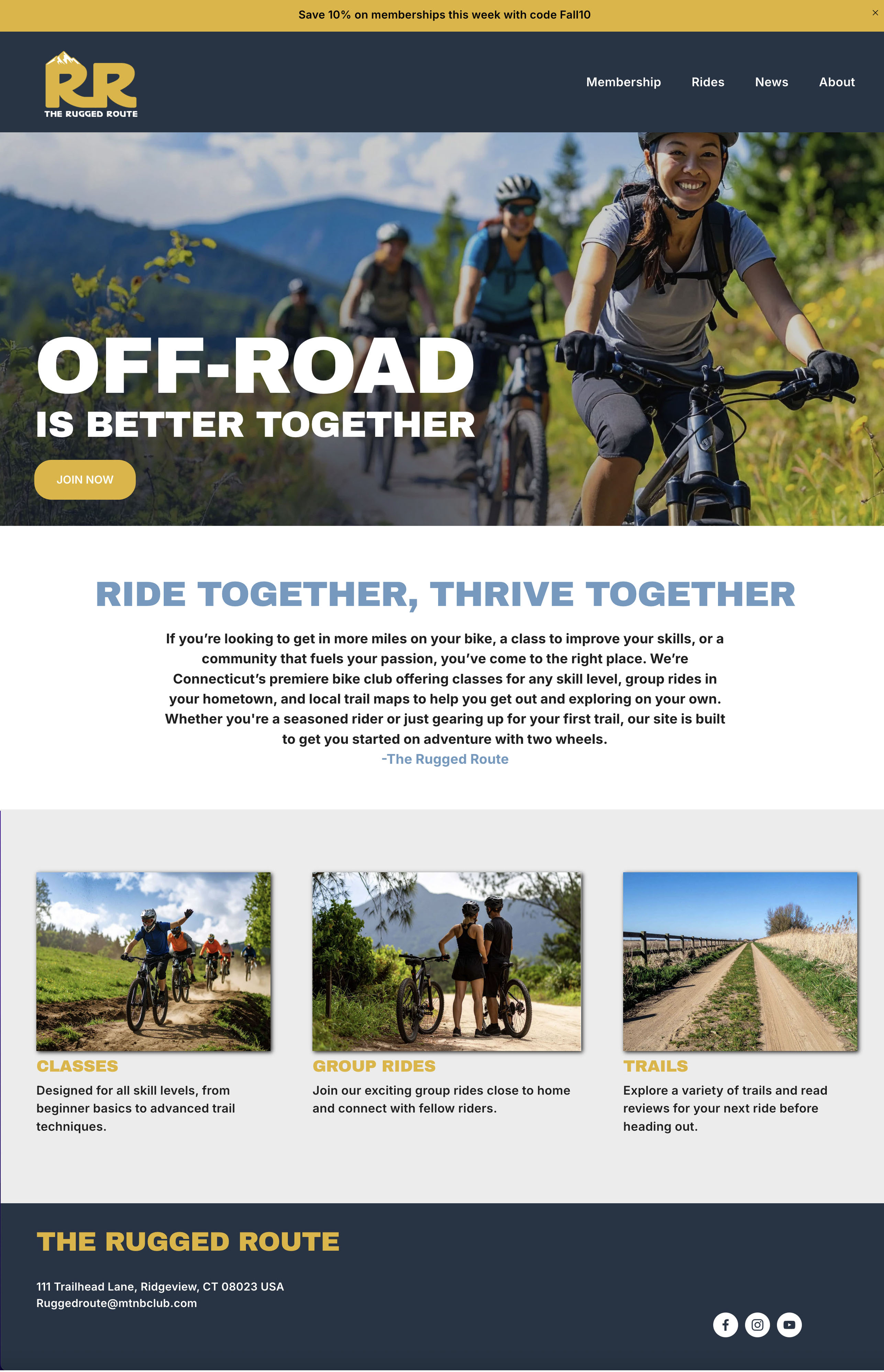
The website I had planned for this endeavor was to create a mountain bike club for Connecticut residents called The Rugged Route. As a members-only club, it will offer classes, as well as local trail maps, group meet ups, and news on the sport. While the entire site will be available to all who visit, it will be geared towards members or people thinking about joining. My goal here is to create a club community that has an online platform to supplement their real-life meetups. The website will not only support the sport, but it will be the digital home base for enhancing the club’s visibility, engagement, and overall success.
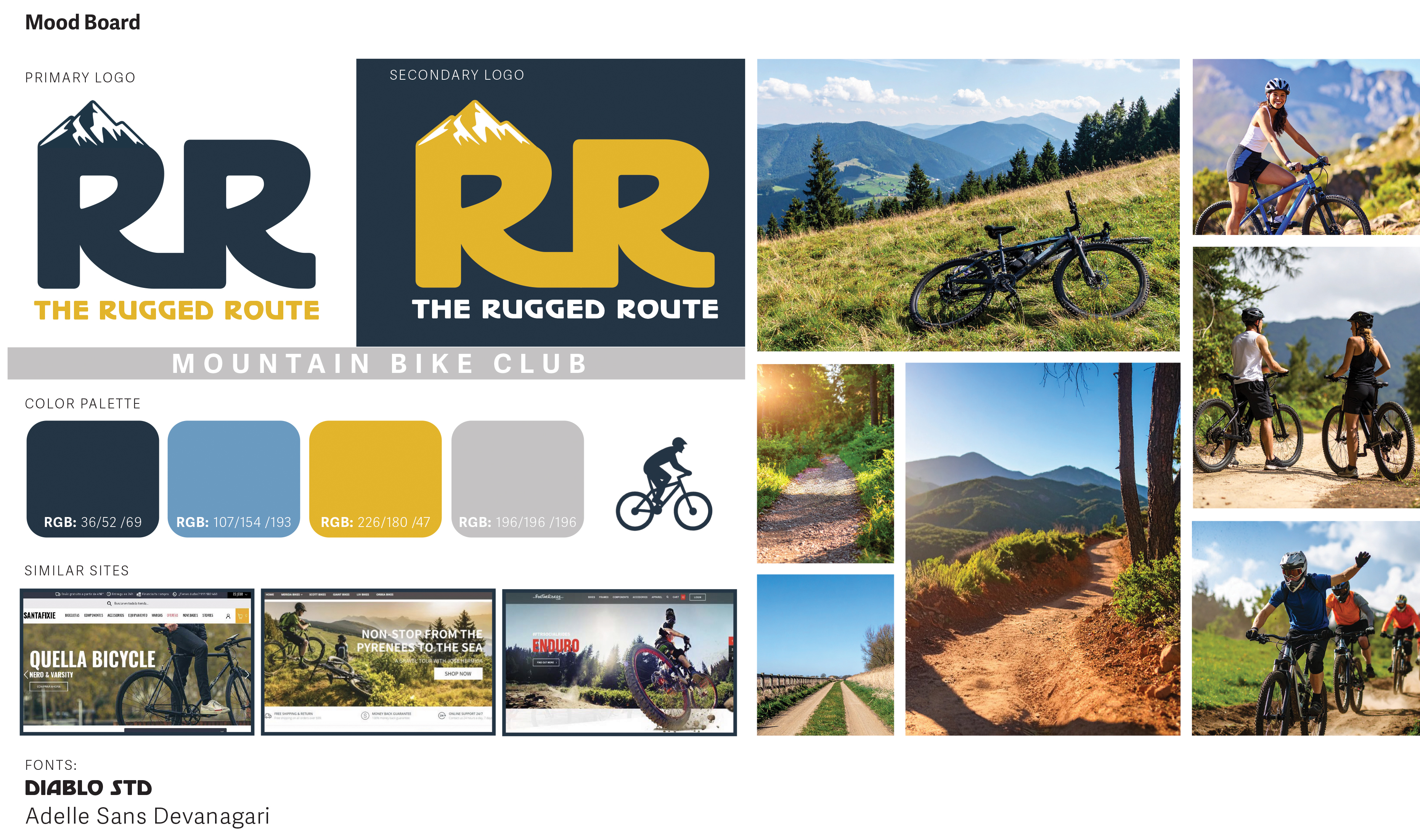
With my idea well thought out, I decided to first make a mood board. This meant that I started to collect content. I gather images I wanted to use on the site, picked a color pallet, and even made a logo for the club. After looking at similar mountain bike sites, I was able to decide on the look and feel I wanted The Rugged Route to have. For me, it made sense that the colors and images would be bold and bright. The site would have a lot of shots showing the outdoors so having these bold colors would fit in with the esthetic of the sport.
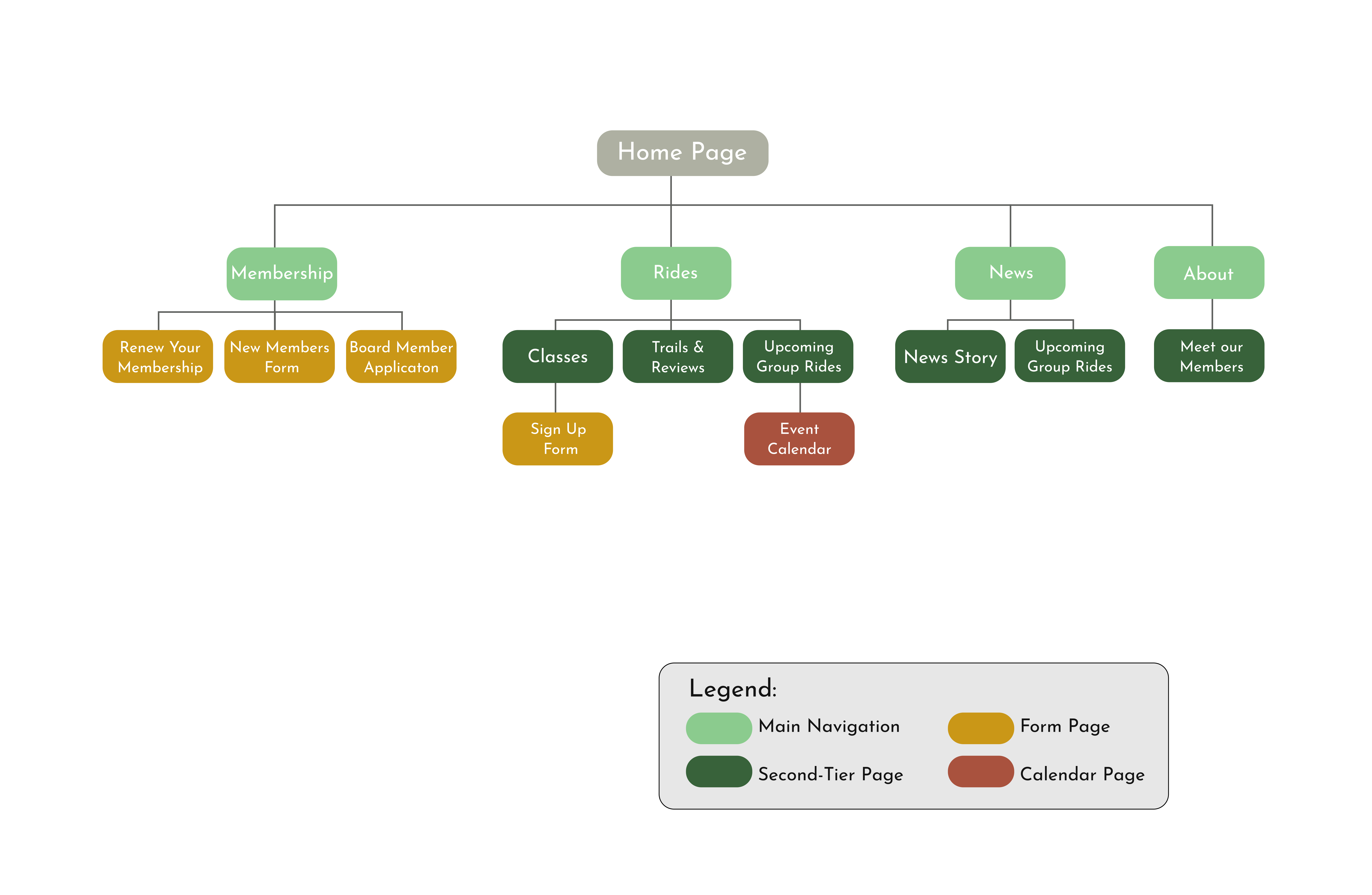
With my style decided on, I then moved on to creating a site map for the entire website. While this can normally be a large undertaking, I was exciting to get my thoughts organized. I knew the homepage would have the usual, with a header navigation and that a part of the site would be various sign up forms. As you can see below, I chose to have memberships, rides, news, and the about page in the main navigation. The rest of the website stems from these four pages. At The Rugged Route site, you can easily sign up for the club, learn about the board members, read up on news, find group rides in your area, or even look up trail maps. The group rides page is listed twice in the site map because I felt this was an important page that would be searched for often. Having multiple paths to this page will allow it to be found more easily. I imagine most visitors coming to the site will be members and this will be a page that they often come back to. I have also designed the site to where most pages lead the user to another page, encouraging browsing, and keeping them on the site longer.
Design & Development
Since my mood board & site map were finished, it was now time to create an account on Squarespace. I went with their Core plan which allowed me to have more customization and have the option to code if needed. Under Squarespace, I also bought the domain name theruggedrouteclub.com. With my account now set up, it was time for me to envision my website beyond the mood board by creating some pages!
But before jumping into the platform, I decided to create the pages in Figma. This would allow me to be more playful since I was comfortable designing in this program, and my skills wouldn’t limit me to a basic template. In Figma, I was able to create some very basic wireframes and then went back and transformed these into more fleshed-out pages. This allowed me to see just how much content I needed for each page, including images and copy. As my pages turned into high-fidelity prototypes, I felt more confident in my club’s vision and overall look of the site. This was a great way to start putting all the pieces together and gave me more confidence as I transitioned into designing in Squarespace.
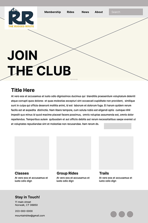
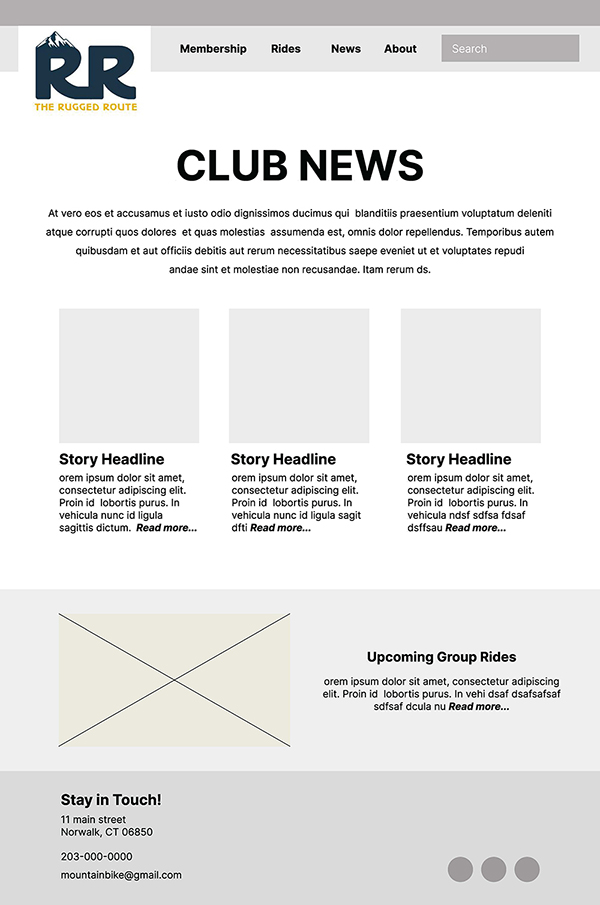
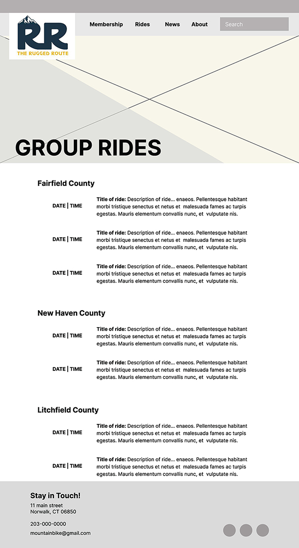

Wireframes made in Figma.
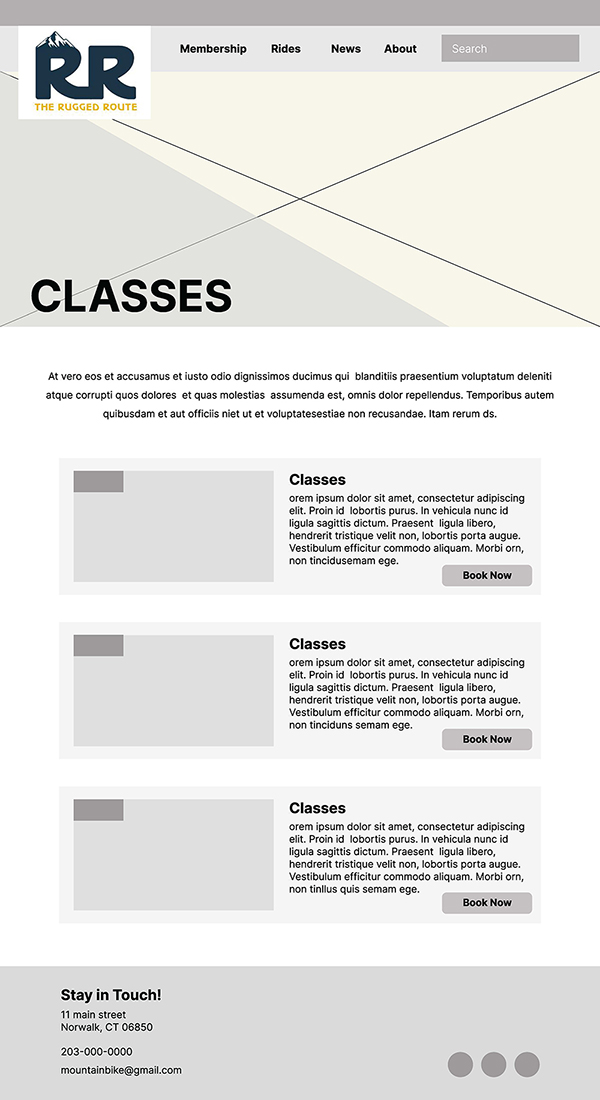
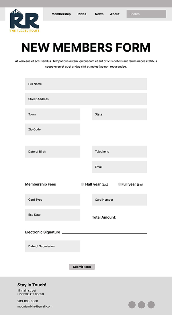
Once I moved over to designing in Squarespace, I found myself being able to recreate the pages easily. Of course, there were exceptions and there were even changes made on my end, but overall, I found the process seamless. Squarespace had many options for adding content, whether that was google maps, calendars, customizable forms, and even adding animation. These features allowed me to build some of my most important pages quickly. The best part was that Squarespace allowed me to build for desktop view but also gave me a preview of mobile view as well. This is key when building a website since most of your visitors will probably be using their phone to look you up. However, I later found out that this preview is not always accurate and its best to test your website privately on a mobile device before launching it.
Through the design process I did wrestle with spacing of text and getting images to fit correctly. But a few pages later I was starting to understand block settings, page margins and how to properly lay out a page that would translate to mobile well. Once I got comfortable with these things I was able to add fun graphics and animations to some pages, which I think will help engage the visitors that come to the site. I even allowed myself to further personalize my pages by writing a few lines of code! The code I wrote allowed me to keep my button text on one line, no matter how small the button scaled. Because some of my buttons were skewing oddly depending on browser size, this code really helped keep the pages looking consistent.
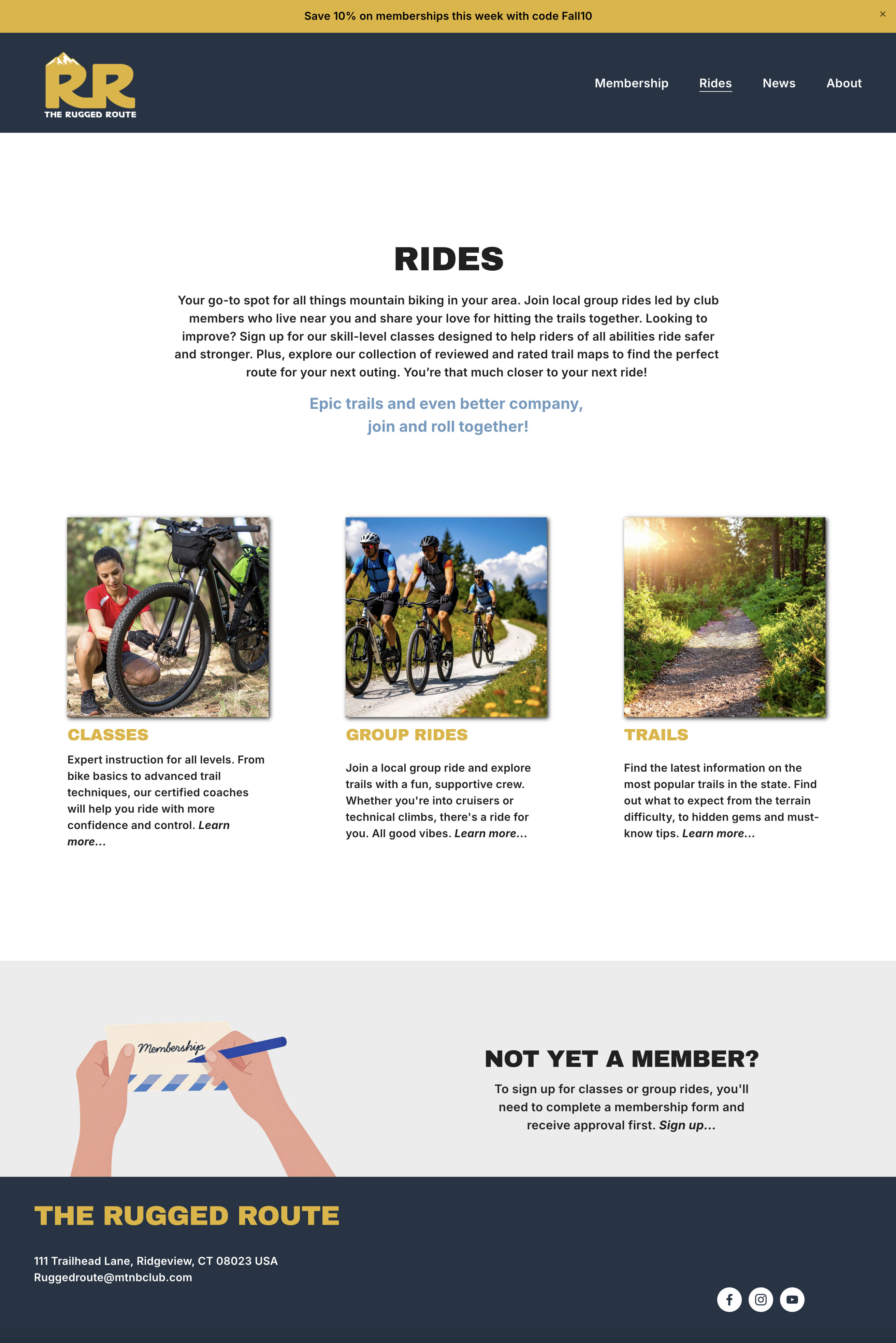
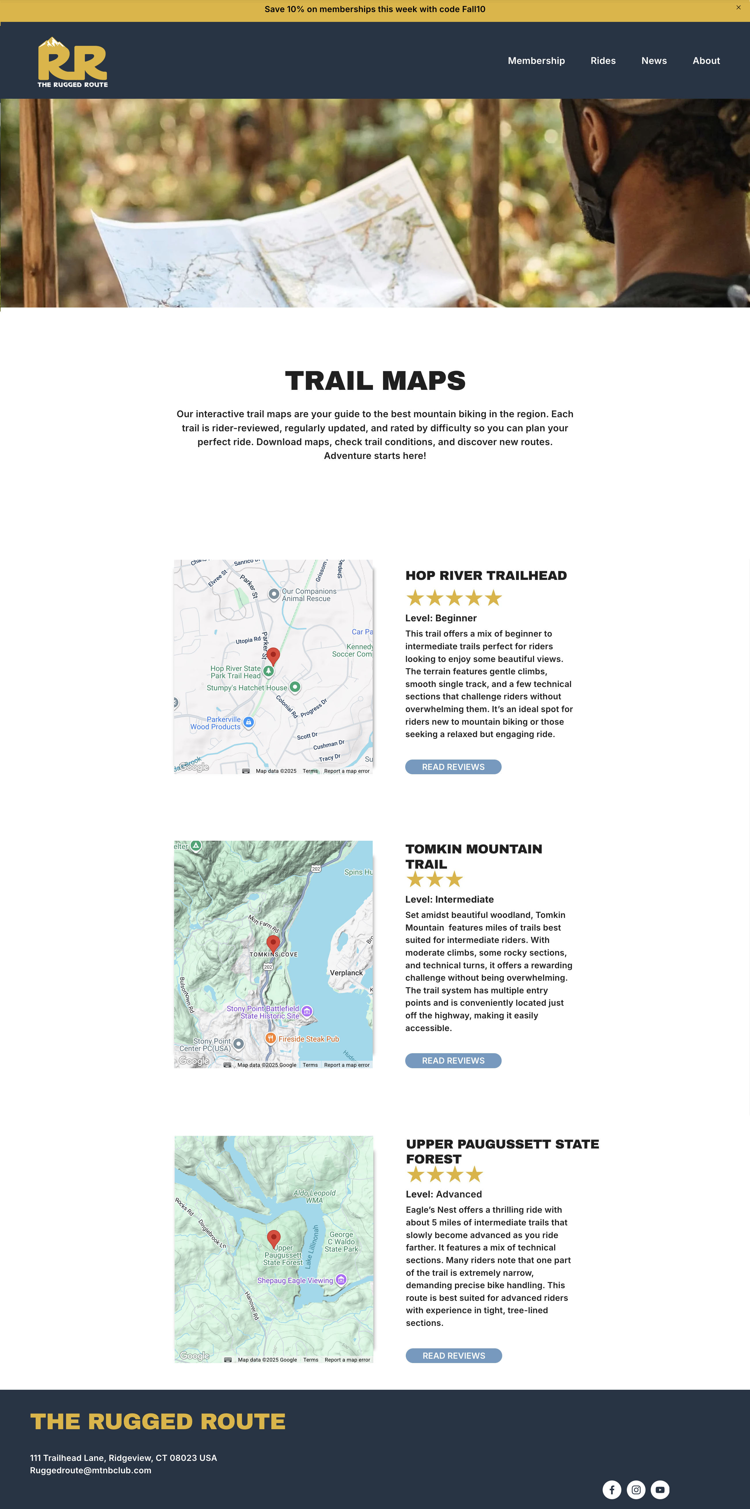
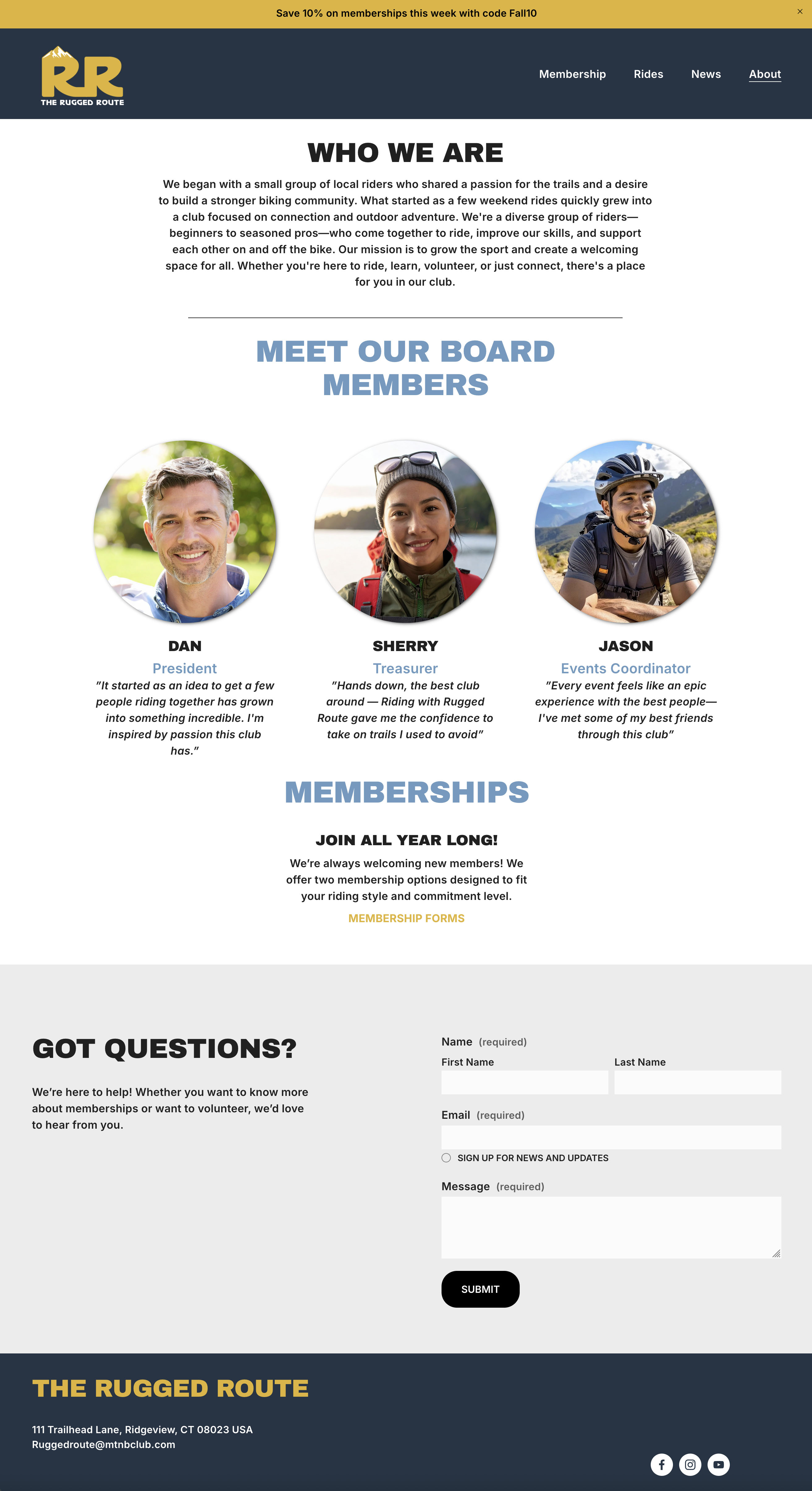

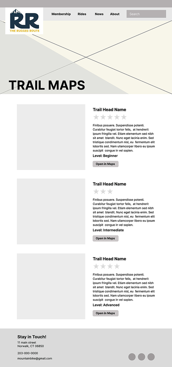
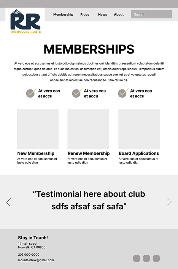
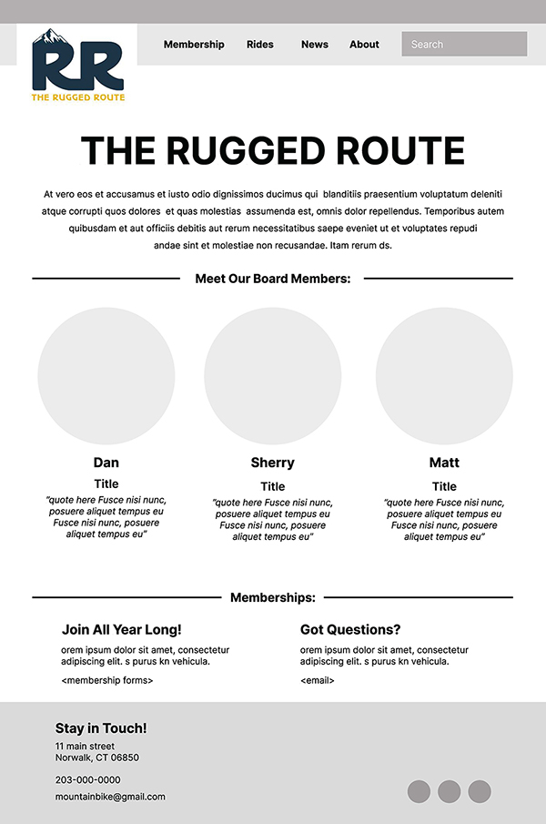
Some pages made in Squarespace.
Site Testing
Once I had all my pages created and linked together, I was able to test the site on tablet and mobile views. Its always important to see how your design translates to these smaller screens. I did have to adjust some copy and button sizes for these formats, so always allow yourself enough time for changes.
I then ran a speed test on my site. This type of test can evaluate the performance of a website, specifically measuring how long it takes for pages to load and tell you how users are interacting with them. Of course I hadn’t had any viewers to the site just yet, so I was mostly looking at how fast my site was downloading. My test results showed me just how slow my website was when loading. This is a major red flag because most websites need to download within 4 seconds, or your users will likely look elsewhere. Luckily, the test done on PageSpeedInsights gave me a break down of why this was happening. It showed me that my images were too large and that they needed to be optimized. With more research I discovered that the best way to fix this is to bring the images into Photoshop and save them as jpegs under save for web legacy. Aim to get your images under 500kb. For small inset photos try for even smaller sizes, under 300kb. Once I fixed my images my score skyrocketed and the speed of the website improved dramatically.
Launching The Site
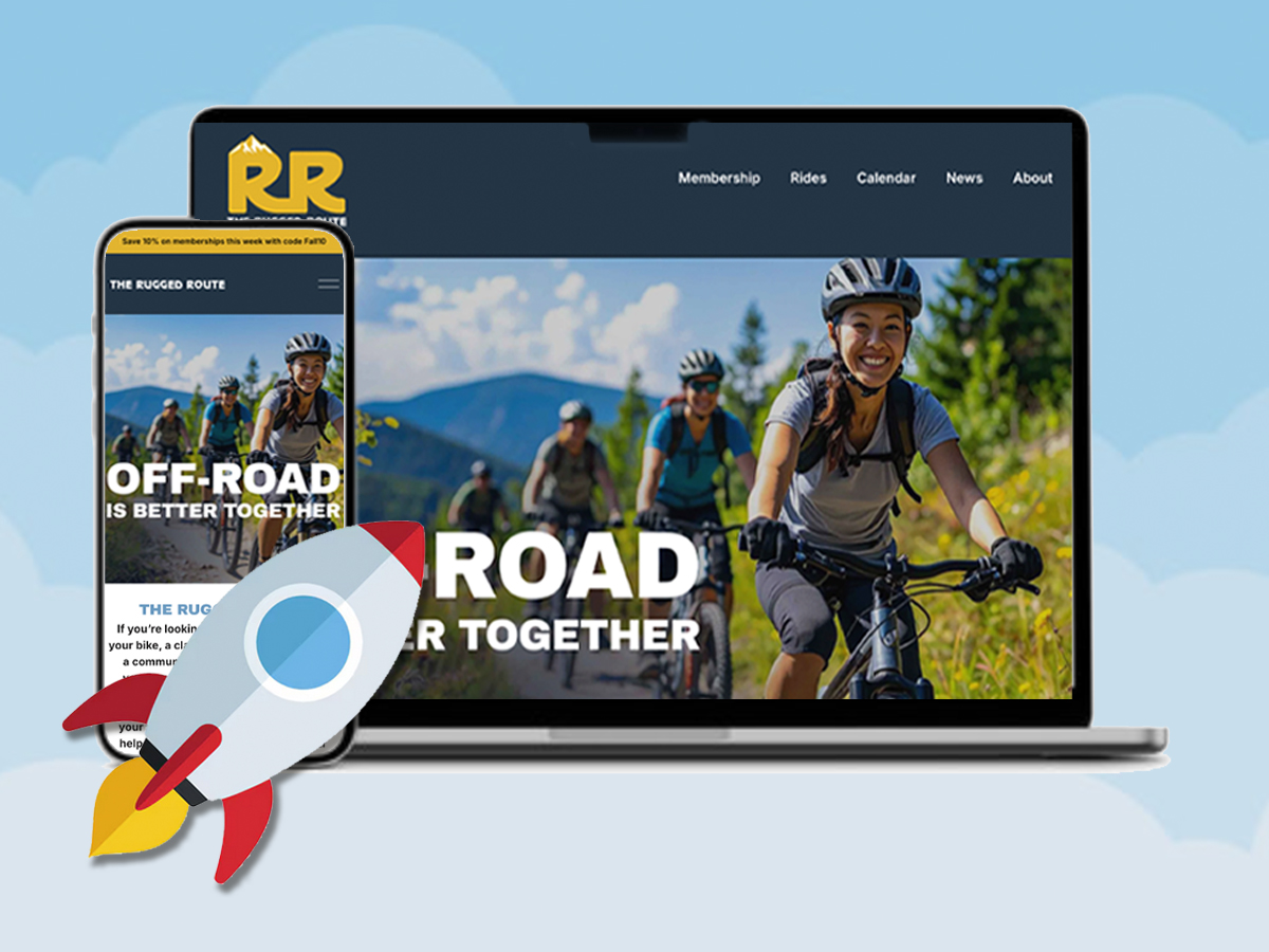
After the site testing I felt the project was complete and ready to go live! This was a big moment for me since I did not think this process would go so smoothly. In seven weeks, I sent into the world a professional looking site that usable on every device and can be accessed from anywhere! While of course there were some design hurtles and lots of YouTube tutorials watched, I’m so glad I went with Squarespace. I would recommend this platform to any new web designer or anyone who needs to build a personal site. If you think you could never build a website, or that this is a job for a coder to do, think again. Squarespace or a similar content management system may be exactly what you need. I was able to leverage my design skills and create a unique site that fit my brand and looked great on screen.
If you’re interested in seeing my full site beyond what’s in this article, you can read more below and visit it at: https://www.theruggedrouteclub.com.