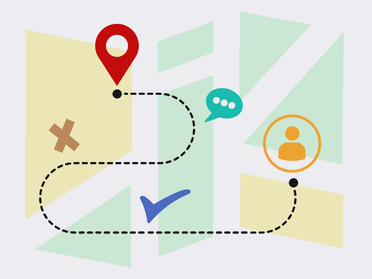
Both user stories and flowcharts are an important step in the UX process. But not everyone knows their purpose or where to implement them into their work. While both are essential for UX design, they also go hand in hand, when designers need to learn about their users and how they interact with their digital product.
User Stories
In the development process, the user story would come first, since this describes the user’s needs and perspectives. This short user story is a brief snippet of the user scenario and gives us quick insight into what the user is trying to accomplish.
Flowcharts
The flowchart, or user flow, is a visual diagram/ illustration showing the path of the user in the digital product. This visual summary shows the exact route the user would take for a specific task, breaking down each step from start to finish.
To make sure users are achieving their goals, designers can use these methods to make sure content is labeled clearly, located in the proper location, and tasks are easily accomplished.
Examples of These Methods
To show some examples of these methods, I’m going to share my ongoing project of taking Ridgefield, Connecticut’s municipal site and turning it into a functional app. This week, I created three user stories and their accompanied flowcharts to envision the user better and see if they would be able to achieve their goals.
My first user was Stacy. She was concerned with paying her taxes through the app and wanted it to be quick and easy since she is a busy mom. Let’s look at her story, her longer scenario and then her user flow chart.
User story: I just bought a new house in Ridgefield and need to pay my first property tax bill this month. I want to be able to pay it easily on my phone rather than having to visit the website or mail in a check.
User scenario: Stacy recently bought her first home in Ridgefield, Connecticut. She is excited to be a homeowner, yet nervous about staying on top of her bills. Now that she owns property, she wants to be able to view and pay her property taxes easily and on a timely basis. Since Stacy is busy working full time and is a mom to two children, she doesn’t always have time to sit down at the computer to pay her bills. Most days she will complete tasks like this in the school pick up line. Therefore, she is looking for the easiest way to view and pay her tax bill from her smartphone. First, Stacy would like to find the tax office number to call, to confirm the due date and to save this number in her phone for any future needs. Then she would like to be able to pay the bill online with her credit card.
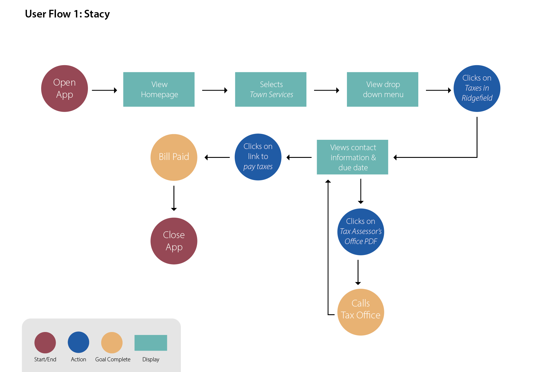
As you can see from the flow chart above, Stacy was able to complete this task with very minimal steps. From the homepage she was able to navigate to Town Services and find Taxes in Ridgefield in the drop-down menu. From there she was able to complete her two tasks: call the office to confirm the due date of the bill and then moved on to paying the bill in the app. Since paying taxes may be a common task the app is used for, the less amount of screen clicks it takes to get there, the better.
Of course, what makes these flow charts easy to read is the different colors and shapes used for each step. The key in the charts clearly shows what is an action, a display screen, a decision, etc.
My second user was Jeff, he was an older resident who is looking for local, free events around town and is eager to meet others in his community. Below is his story and scenario.
User story: I’ve lived in Ridgefield for 15 years, but recently I became an empty nester. I’m looking for community events at the local library or any free events around town to meet other locals.
User scenario: Jeff and his wife have sent their last child off to college and are now empty nesters in their house. With his kids grown, and out of the house, he has become lonely and now has a lot of free time, which he hasn’t had in the past. Jeff has decided that it’s time to meet more community residents and to get out of the house more. But because he is still paying for his child’s education, he is on a budget and looking for free events. His first idea is to look on the town website to see if the local library is having events he would like to attend. He would also like to see if there are any other free events the town is running where he could meet others around his age, in his community.
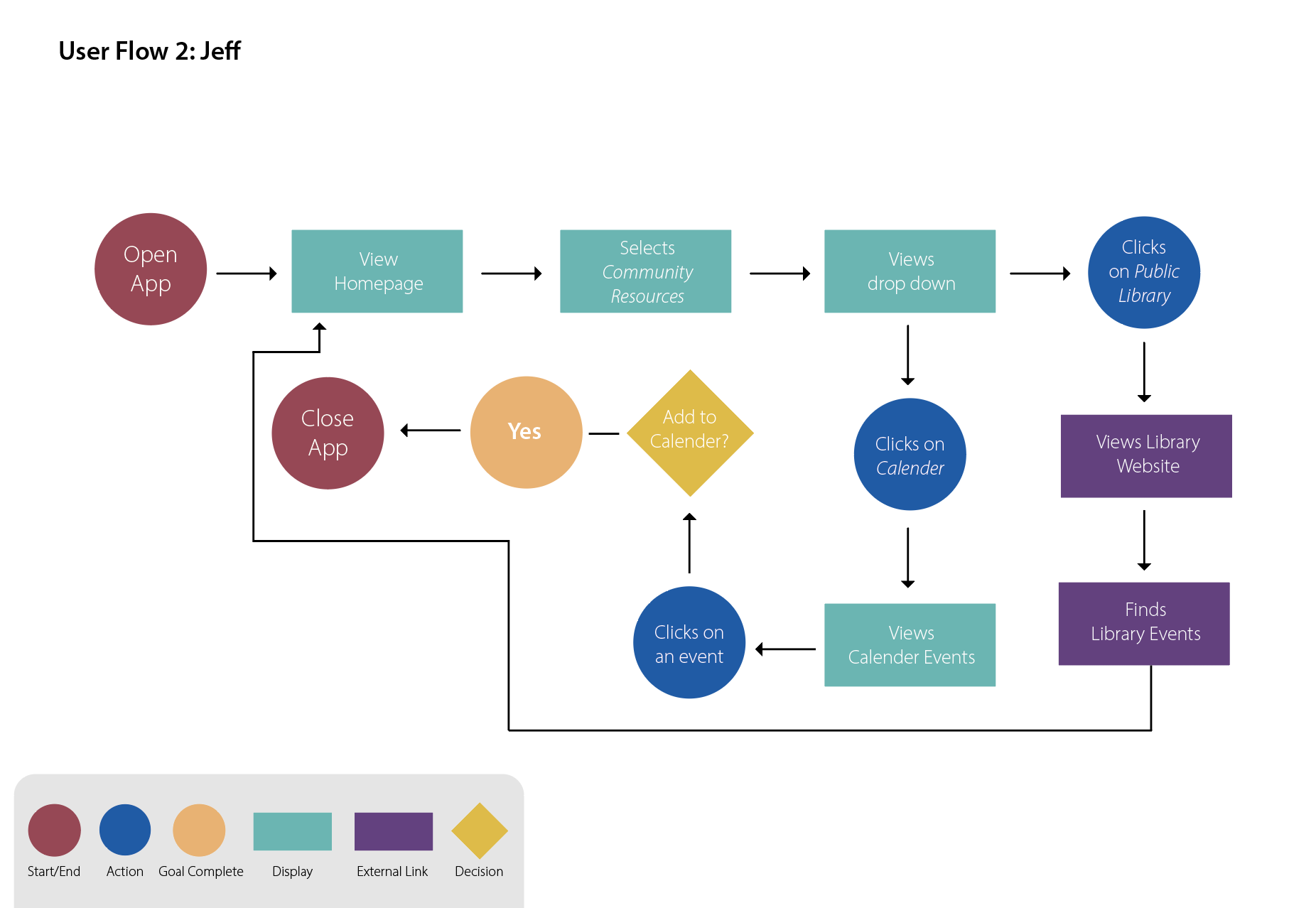
Jeff’s flow chart is a bit more complex since part of his task will take him out of the app and into a website. I envisioned his first step as selecting the Community Resources tab and would first view the public library link. This would ultimately take him to the library website to see their events page. But once he was done with that, he would return to the app and continue to see the other tabs listed like the Calendar page where he could view town events and add them to his phone calendar. Though, it makes me wonder if a sub category should be under community resources.
Looking over this flow chart there were multiple avenues Jeff could have gone down, but I think calendar events and the library link would be the most common pathways. I believe both paths were short enough to complete the task and would have allowed him to have time to browse the app freely for additional information.
Richard is my third user, and he is a new resident in Ridgefield, Connecticut. His task is to find information on the town, sign up for emergency alerts and follow the town’s social media channels.
User story: As a new resident to Ridgefield, I’m concerned about town safety. I want to be able to get emergency alerts on my cell phone and follow the town on social media channels so that I can interact with the city and community.
User scenario: Richard recently moved to Ridgefield for his dream job and plans to stay in the town for the foreseeable future. He fell in love with the town’s charm but is concerned about staying safe downtown. He wants to stay informed on the latest happenings, preferably in the morning, on his way to the office. But he will only have his smartphone with him when commuting. He is looking for a way to become an informed citizen, while also engaging with the community. Richard is interested in signing up for town alerts, and following the town socials, if they exist. He wants to make sure he is prepared for an emergency and to be the first to know of any breaking news.
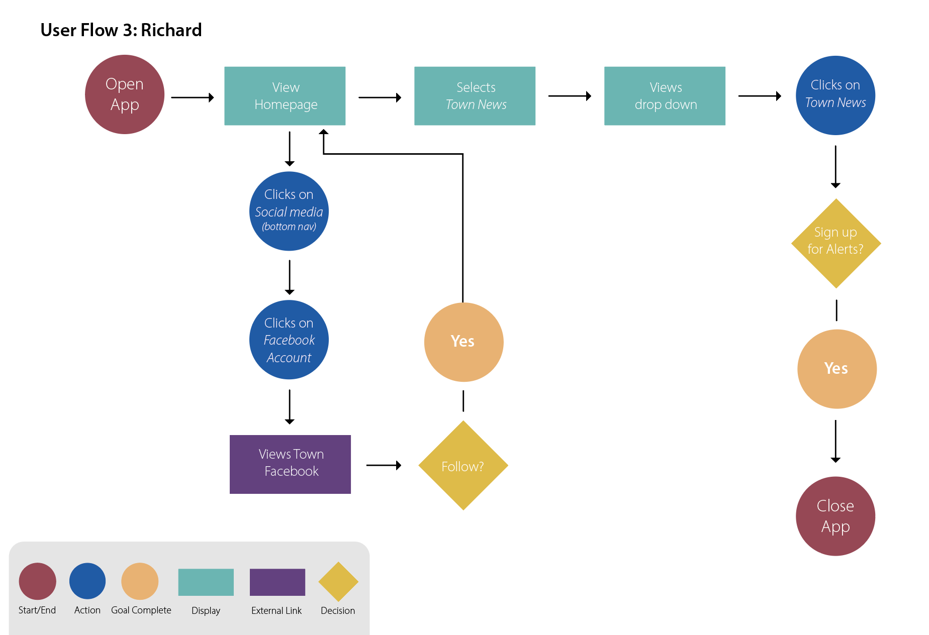
Richard’s flowchart is also pretty busy. I imagined him first clicking on the Social Media button that would be in the bottom navigation of the app. This would be part of the app that is available on every page, including the homepage. Richard then finds the Facebook link on the next screen, clicks on it and is redirected to Facebook where he can follow the town page. Once back in the app, he could click on the Town News section and would easily navigate there. While this page has all the town news he is looking for, it’s also where he can sign up for alerts, and does so easily.
Looking back at his steps, he also had minimal screens to click through, thanks to the quick bottom navigation tab. But from this exercise I am wondering why signing up for the newsletter isn’t in this same category. This is something Richard, or a similar user would also be interested in. There may also be reason for Richard to visit the public safety drop down – to view the latest information from the safety director and the health department.
Benefits of These Methods
With these three users in mind, I was able to see clearly how one would navigate through the app to find information. It has not only shown me where certain bottlenecks may be in the navigation but has also shown me if certain tasks take too long.
After crafting your own user flows, there may need to be some reorganization and other relabeling needs. But this is exactly what these methods are intended to do. They shine light on areas that are confusing and help you find where pieces fit best.
Personally, from my user stories, I was able to imagine three very different users and how each one would approach the app differently. No matter where you are in your digital product’s lifespan, it’s important to think about how users will come to use your product and how users may perceive it. I encourage you all to take time to craft user stories, user scenarios, and flowcharts to help better visualize your product in someone else’s hands.
If you would like to read more about my current work for Ridgefield, Connecticut’s municipal app please see the PDF below.