
This week, I spent some time updating my personal brand and that means I spent a lot of time playing with color. It brought me back to my early days of design, where I often struggled to choose colors and make color palettes. But once I learned color theory, it transformed my approach and my work. Understanding how colors interact is essential for every designer, yet it’s often thought as too simple of a concept, never getting the attention it deserves. Yet, when creating user interfaces, it’s ideal to know what emotions colors evoke and how to choose colors that work together. Whether it’s for a logo, or an illustration, the colors you choose relay a message and give off personality. It can give a brand either a positive disposition or send mixed messaging. So, let’s go over the basics of understanding color and how we can use it to our advantage.
Psychology of Color
In UI design, the colors we choose can help us engage with our audience and be remembered. In fact, according to Gavin Edson, from D5Media, an evaluation of a product is done within the first 90 seconds of exposure and 62% to 90% of this evaluation is attributed solely to the product’s color. It’s one of the first things people will notice about your brand, so choosing the right colors are critical. Now it should be said that sometimes, different cultures and religions have different views on color, but generally, the feelings we get from seeing certain ones are universal. Below is a color chart I refer to often.
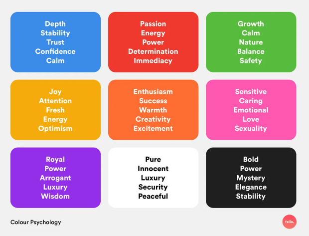
Generally warm colors like yellow and red will bring a sense of vibrancy and power to your work. In contrast, cool colors, like blues, greens, and purples give us tranquility and serenity. If you choose neutral colors like brown, grey, black, or white, they can be used to balance out a palette.
The 60-30-10 Rule
Now that we know the psychology behind color, it’s time to learn how to use your palette within your design. No matter what you’re creating, you should label one color your dominant color, one your secondary color, and another your accent color. The key here is to know what colors should show up most in your design, and which colors are just accented throughout. You can have more than three colors in your palette and adjust the percentages, but for this example, the 60-30-10 rule is what we will be referencing. In most cases, you will probably only have one main color – which will be used 60% of the time. This is your dominant color, which sets the overall mood. Your secondary color will be used 30% of the time and support the primary color but also provide contrast. Lastly, you’ll have the accent color or colors, which you’ll use on occasion and used to highlight specific details or draw attention. Using this method helps designers create balanced color schemes and cohesive products. Helping guide a viewer’s eye, while also helping them process visual information quicker.
Accessibly and Color
When picking colors, we must also remember to follow the accessibility guidelines. Web Content Accessibility Guidelines or WCAG, are rules that ensure that people can read, understand, and use technology without relying on color perception. For designers, this means choosing colors with enough contrast so users can clearly distinguish and read all text and visual elements. According to WCAG, your background-to-text contrast ratio should be at least 4.5:1. This ratio means foreground text must be 4.5 times brighter or darker than the background, applying to all text and images.
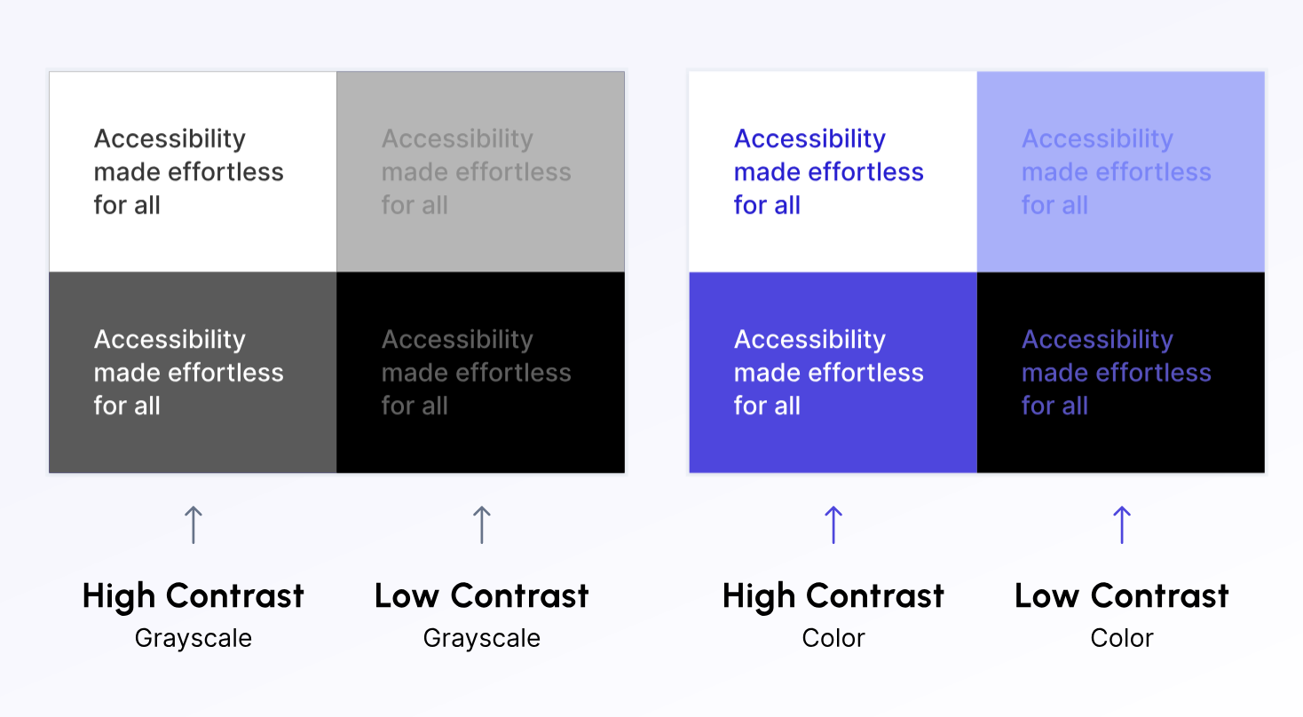
In the example above, the most readable sections were ones with high contrast. Specifically, the white background with black text, dark grey background with white text, and the white background with purple text. Even the dark purple background with white text works well because there’s enough of a difference in brightness between the foreground and background. Now of course font size and weight also play into helping readability, but strong color contrast is what ensures your content remains clear and accessible for all users. Regardless of their ability or vision.
Go Forth and Color
Picking colors doesn’t mean just picking what looks good. A color palette made after understanding color theory is a skill that will shape all your designs going forward. Once you fully understand colors and how to use them, you’ll be able to see their full value. You’ll be able to create interfaces that are visually stunning but also easy to read, enjoyable to navigate and welcoming for all users. So, the next time you’re focusing on a design project, remember how these colors show up in the world, and use them with intention. Your choice can influence how your audience feels, understands, and connects with your brand.

 The Creative Corner