As the title suggests, making high-fidelity prototypes is a journey. It’s a process that can only be done after rounds of sketching low-fidelity prototypes, doing user testing, and assessing user feedback for difficulties. These high-fidelity prototypes are realistic representations of the final product and can be used for additional user testing or help stakeholder buy-in.
As I entered this last stage of the development process for my municipal app, I became aware of just how important it was to go through each of these steps before I got to designing my high-fidelity screens. For the Town of Ridgefield app, user testing was a pivotal turning point. It was in this stage that changes were made to a few of my ideas and screens. Many of these changes I would not have predicted, and I’m sure many designers can relate to this because we often think our designs are flawless and will make sense to others. But as I discovered, before i could start designing my screens with colors, images, and fonts, I had to interpret my user feedback and tweak some features within the app’s layout.
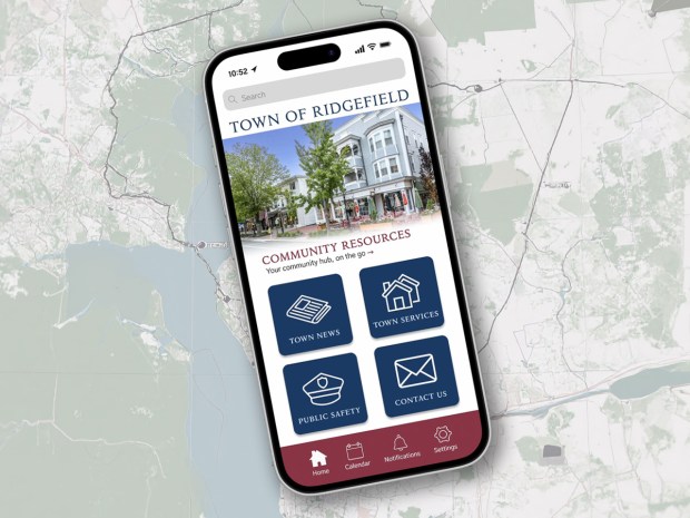
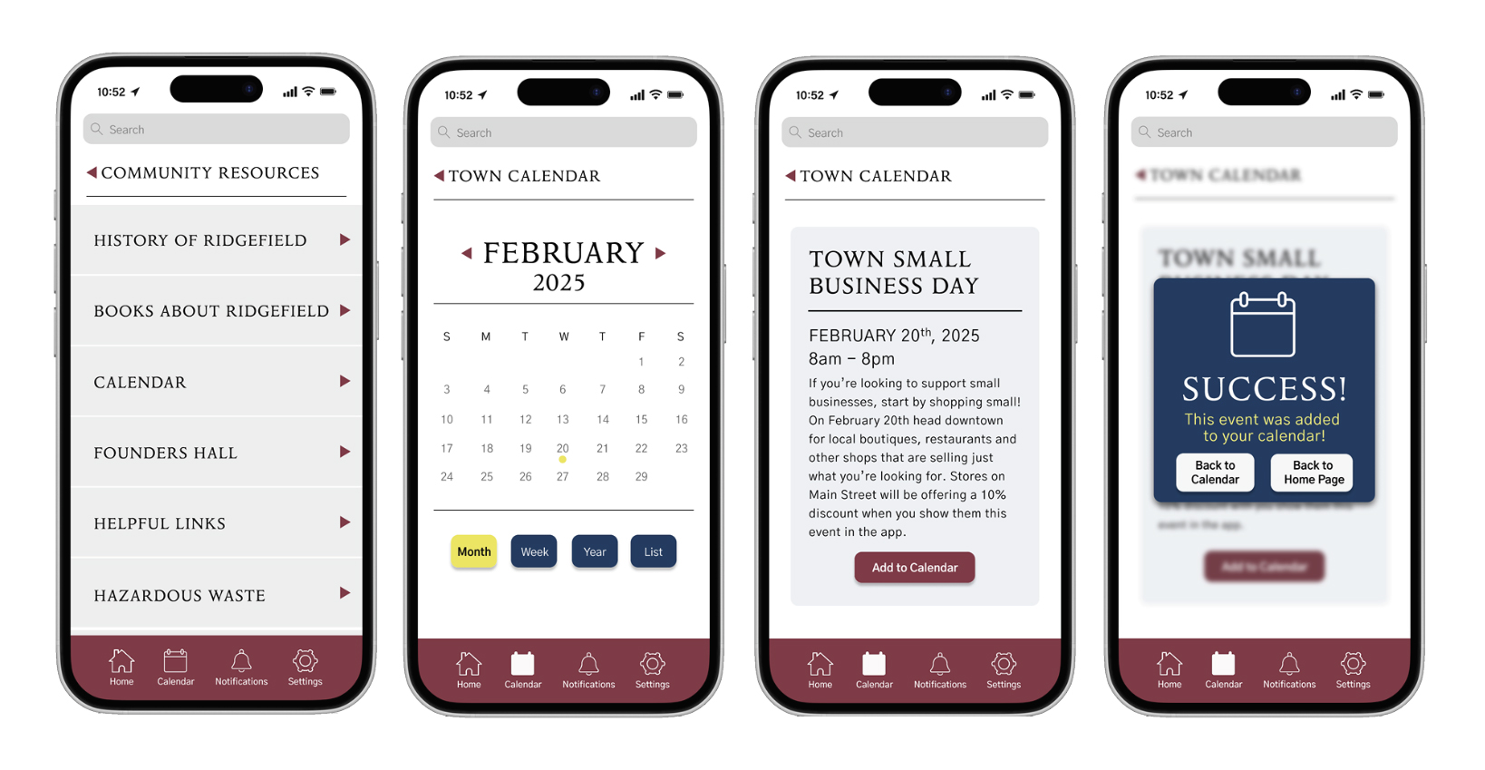
One of the first things I noticed from testing was that one of my participants consistently wanted to use the bottom navigation bar. They wanted to click on the calendar icon when asked to add an event to their calendar. This got me thinking that maybe having two calendars in the app was too confusing. So, when it came to designing the high-fidelity prototypes, I decided that adding an event to the calendar should just add it to the user’s smartphone calendar instead. This way the bottom navigation icon can also direct users right to the town calendar. Making it easy to go back in and check out more events. The best thing about this change is that it also led me to think about giving the user clues about where they are within the app’s structure. So, if the user is in one of the pages listed in the bottom navigation, it will be highlighted in white. This allows the user to understand the navigation of the app better with a quick visual cue.
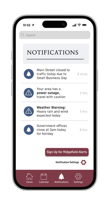
This same user also wanted to use the notifications button in the bottom bar to sign up for town alerts. So I decided that this task should also be able to be done two ways. I agreed with the user that the notifications page should include this option, and while I hadn’t originally sketched this page out, I decided to create it when I was making my high-fidelity screens. While I had no previous sketch to go off of, I decided to keep the design similar to other notification pages I had seen. While the notifications are presented as a list, there is a button in the bottom right corner that gives the user the option to sign up for Ridgefield alerts. Clicking this button directs them to the same Ridgefield alerts page they would find in the latest news category. With fewer clicks, this task can be completed even faster this way. A major improvement for users who were already looking for notifications.
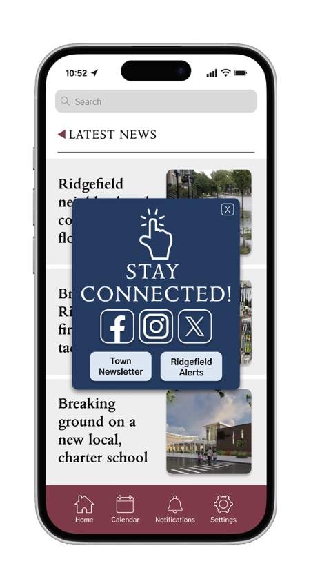
During testing, I also noticed that users wanted to go back to different pages once a task was complete. Some clicked to go back to the task page while others struggled to get back to the homepage. While I did provide an “X” button that would take them back to the homepage, it got overlooked every time. My theory is that when you get a pop-up, you usually think clicking the “X” will just remove the pop up, rather than taking you to another page, so this button needed to be removed. After removing this, my low-fidelity prototypes only had one button- which was going back to the task page. So when making my high-fidelity screens, I added a clear “back to homepage” button to the pop up. This way users would have two clearly labeled options of what to do next.
Last screen includes the updated pop-up design.
It should also be noted that I did keep the “X” button for the town alerts pop-up only because I felt some users may just want to read articles and not sign up for alerts or go to the town’s social media pages right this moment. For this one, I felt an exit button should remain.
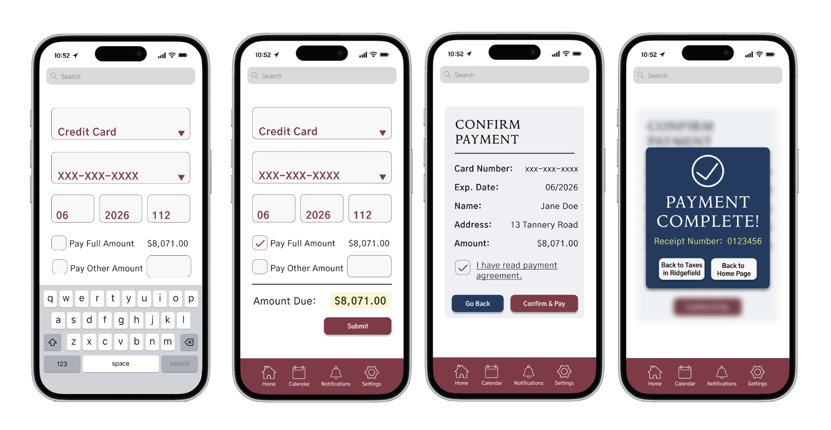
The last change from user testing was to make the EMS services application one page only. I had originally thought that breaking up this application into two pages would help the user, but this actually did the opposite. Both users stumbled when trying to figure out how to get to the next page, probably because the button was too small. After seeing them struggle and doing some additional research on best UI practices for apps, my solution was to make it one long, scrollable page. I learned that most users would prefer to scroll rather than clicking to move on to a new page. Therefore, making the application one page can shows the user just how long the form is and allow them to decide if they should fill it out now or later. Scrolling through the final application in the clickable prototype made me realize that sometimes one long page is better than breaking up similar information. This task now flowed much better.
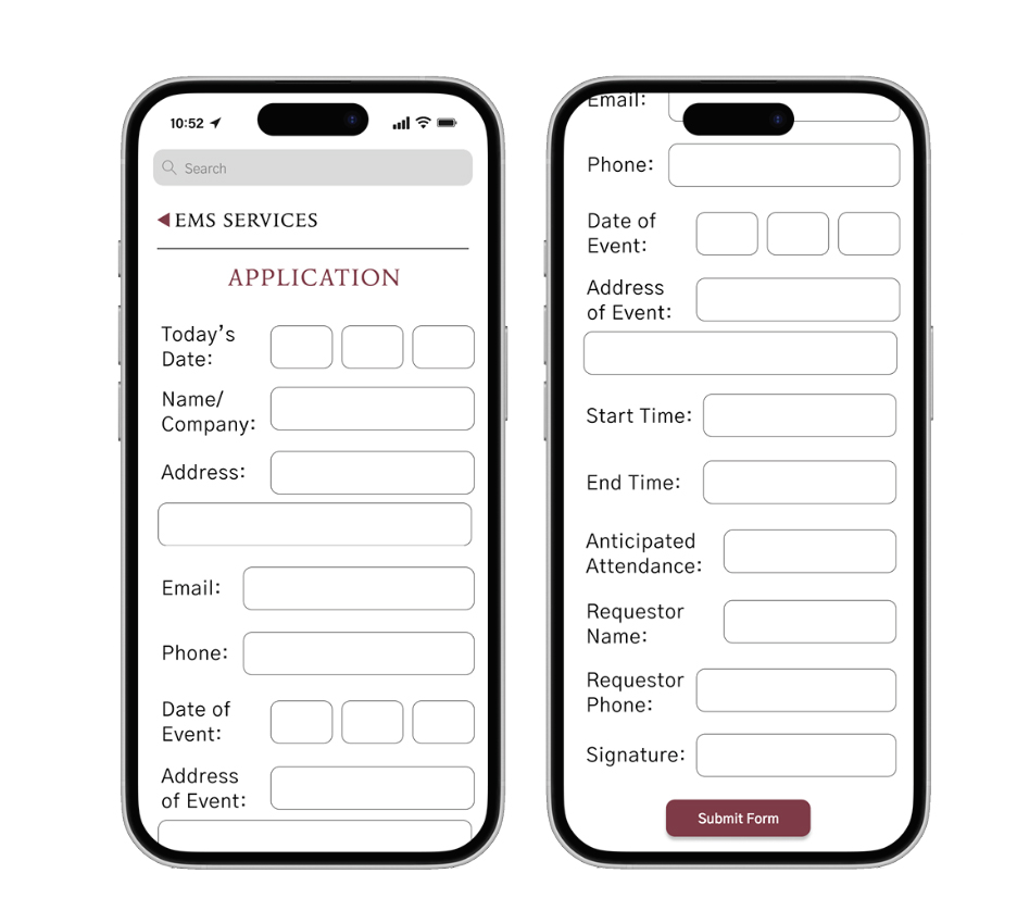
with a large submit button.
Without user testing, I’m not sure what my high-fidelity screens would have looked like. While they may have looked pretty, they may not have been functional, and I am very happy with how they turned out. Working on the Town of Ridgefield app has proven that no digital product can be successful without going through the steps of ideation, testing, and refining. This process has allowed me to be more creative in the beginning stages and allowed me to review every feature and button to make sure it had a purpose. Without each of these steps, I’m not sure I would have arrived at the same final piece I have now. I encourage all designers to work though these stages and give yourself time for each step with your digital product. With it, your high-fidelity prototypes can shine even better than you intended!
To see my walk through video of my high-fidelity prototype click here.
The final document for this project can be read below.
 The Creative Corner