Ever come across an app or website that is so difficult to use you just gave up? It probably lacked proper usability testing. But what is usability testing you ask? It’s when you evaluate a product or system by giving it to real people to interact with and to complete tasks with. If you’re in the process of creating a digital product, thinking about your users, customers, or audience is just the beginning. Well-designed products come from creating and then testing it on your users, before it can be considered complete. It’s a back and forth, until all errors and difficulties are fixed. Without usability testing, it’s almost impossible to imagine how people will interact with what you built and therefore making your product memorable for all the wrong reasons.
Paper Prototypes for User Testing
Luckily, not all usability testing requires fancy software, a conference room, or a dozen of willing participants. Sometimes meeting with a smaller group of users, virtually, will do. Even using paper prototypes will work for usability testing. Of course, when it comes to the design process, testing early and often will give you the best path for success.
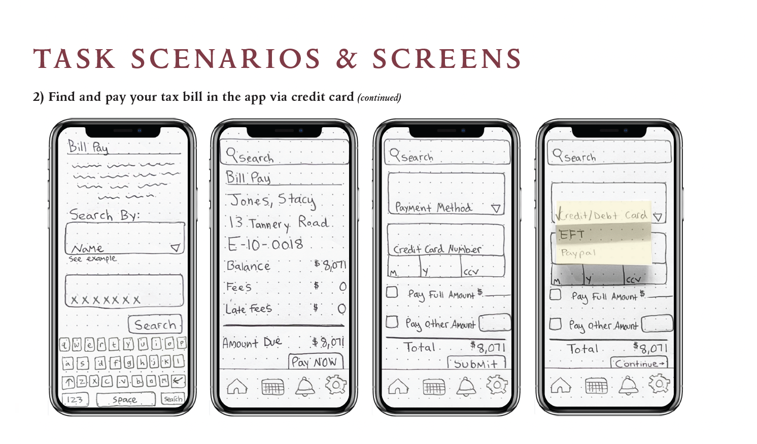
As I discussed in last week’s blog, I drew over 30 paper prototype screens to bring my app, Town of Ridgefield, to life. This process allowed me to put together my ideas and concepts into something more tangible, and this week I chose to do two user tests with these paper prototypes.
Some early sketches of my prototype.
Since I am in the early design phase and only have these sketches, it’s the perfect time to see if I’m on the right path and if users find any major issues. No matter how you choose to create your prototypes, gathering user impressions will always be better than your own intuition. Being able to watch a user work through certain tasks brings so much to light that you probably weren’t even aware of.
Prepping
For my project’s usability testing, I chose two participants that fall within the median age range of Ridgefield residents, with varying degrees of app/smartphone experience. This was important to me because the main goal of the app is to service a variety of residents in Ridgefield, Connecticut, and must be user oriented. I also made sure that the tasks I picked out were different enough so that many of the screens I drew would be evaluated by the participants. It only takes one badly designed screen to turn users away for good, so now was my chance to test a variety of routes within the app.
My next step was to upload photographs of the screens to the POP app. This Prototyping on Paper app is a great tool for virtual testing and allows you to create an interactive prototype with all your screens. Its functions just as it would as if the app was fully developed. Your low-fidelity sketches are now usable prototypes, perfect for user testing!
My POP prototypes can be viewed here.
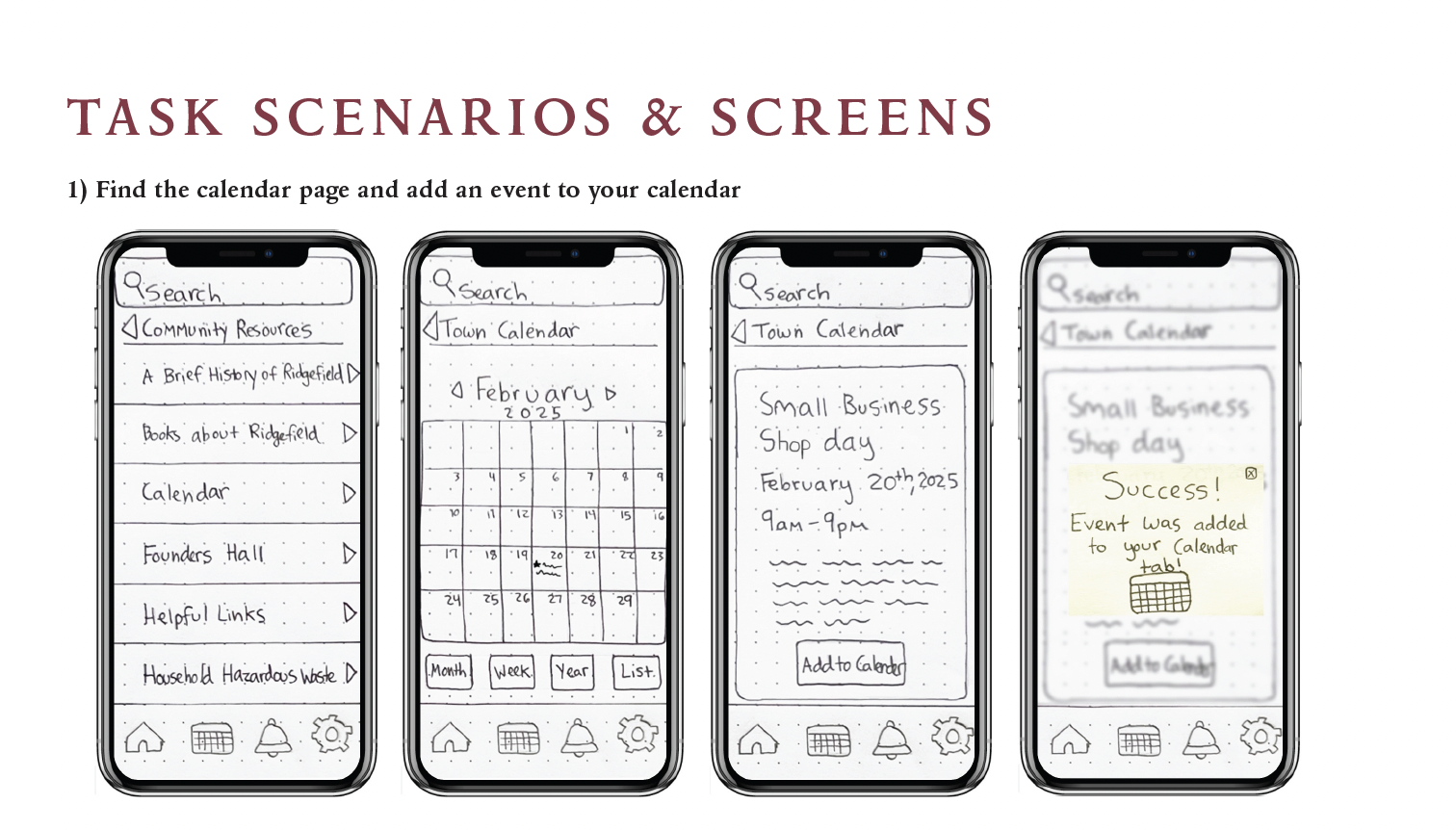
Early prototype showing how to add an event to the calendar.
As I mentioned earlier, virtual usability testing is common these days and also has some advantages. For this test, my users would be able to use this digital product from the comfort of their home and allow them to access the pop link on a computer they are comfortable with. Your participants may not always voice it, but they appreciate these small things, especially when they are nervous about evaluating a product they are unfamiliar with.
Now that my prototype was ready for testing, I moved onto crafting the script with instructions. A pre-written script allows you stay neutral when speaking to the user and also helps each testing session remain consistent. One thing to avoid when doing user testing is to help or guide the user. If you do this, the feedback is useless since you’ll never know if they were able to complete the task without your help. Always let the user complete it on their own, no matter how awkward it may get. Of course, always let them be able to ask questions and provide an environment where they know its OK to mess up. Remember, you’re testing the product, not the user!
Testing
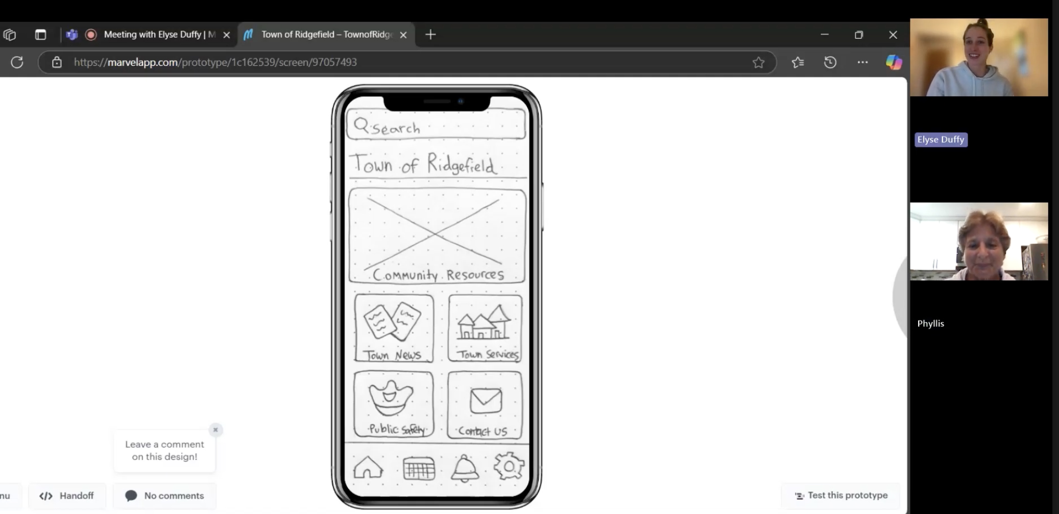
Virtual user testing done with Marvel’s POP app.
Testing day is always exciting. Seeing your prototypes being clicked through allows you to examine all the features in a new light. After all the work you’ve done so far, recording the session is a good idea. This way you can refer to the video when your boss asks how the testing went or just to view the user’s facial reactions (both equally important). Once you have explained the testing session to your user and see that they are comfortable, you should be able to read off the first task.
Results
As with most usability tests, yours may reveal some short comings, and the findings will bring some changes for the next round. This is normal. For my app project, my testing brought to light a few issues, and while frustrating, I know fixing them now will save me time and money in the long run.
Thinking back to when I was sketching, I thought my sizing of certain features made sense and was impressed with how I was able to fit what I needed to nicely. But user testing revealed to me that my pop ups are too small. In one of my tasks: signing up for the Ridgefield alerts, one of my users had trouble finding the alerts button and originally clicked on another button instead. This led me to think about creating a larger pop up where there are clear distinctions between buttons.
Another short coming was the bell icon in my bottom navigation bar. One user thought she could easily find the town alerts by going here which is a valid point! All users will probably want to see any and all alerts quickly, so they should be able to get there with just one click. Next week I will be adding alerts to this notifications page and for first time users, they will receive the same pop up on this page, encouraging them to sign up.
One last issue that came up was that some forms and applications would benefit from being one page rather than multiple pages. Sometimes users prefer scrolling rather than clicking from page to page. I plan to change the EMS services application to one page since a user had trouble figuring out how to get to the next page and stumbled with certain payment check outs. While this was a surprise to me, after doing some research, I found out that scrolling is considered more user friendly than clicking continue or next all time.
Usability Testing Can’t be Skipped Over
As you can tell, even with just two users, who I tested virtually, the feedback I got was invaluable. Even with the smallest budget, one user test can be beneficial. As you go through your own design process, it may be hard to step back from time to time, but it’s a step we can’t skip. As UX designers, the best thing we can do for ourselves, and our product is to test early and often. Even simple sketches can reveal pain points and highlight features that are working. Without it, we risk producing a low-quality product. But with the proper usability testing in place, we can create products that are remembered for being not just good, but great.
The full document of my user testing can be found here.