In the design thinking process, prototyping is the most exciting in my opinion. This stage is for creating tangible mock-ups that show your ideas from your research and brainstorming. This process allows designers to step back from “designing” and to start sketching, drawing, and pasting together simple concepts that they can later test on users.
The benefit of creating low-fidelity prototypes by hand are meant to be quick and allow the designer to experiment with different versions to find the best solution. It also helps the creator to focus on navigation rather than fidgeting with visual details. On top of being affordable and available to everyone, prototyping allows any creator to test designs, layouts, and functionality all with just some pen and paper at the very least.
For me, being able to do some prototyping for the app I’m creating led me to a breakthrough week! This is my fourth week working on an app for the town of Ridgefield, Connecticut, and it’s also the week I started to see ideas blossom.
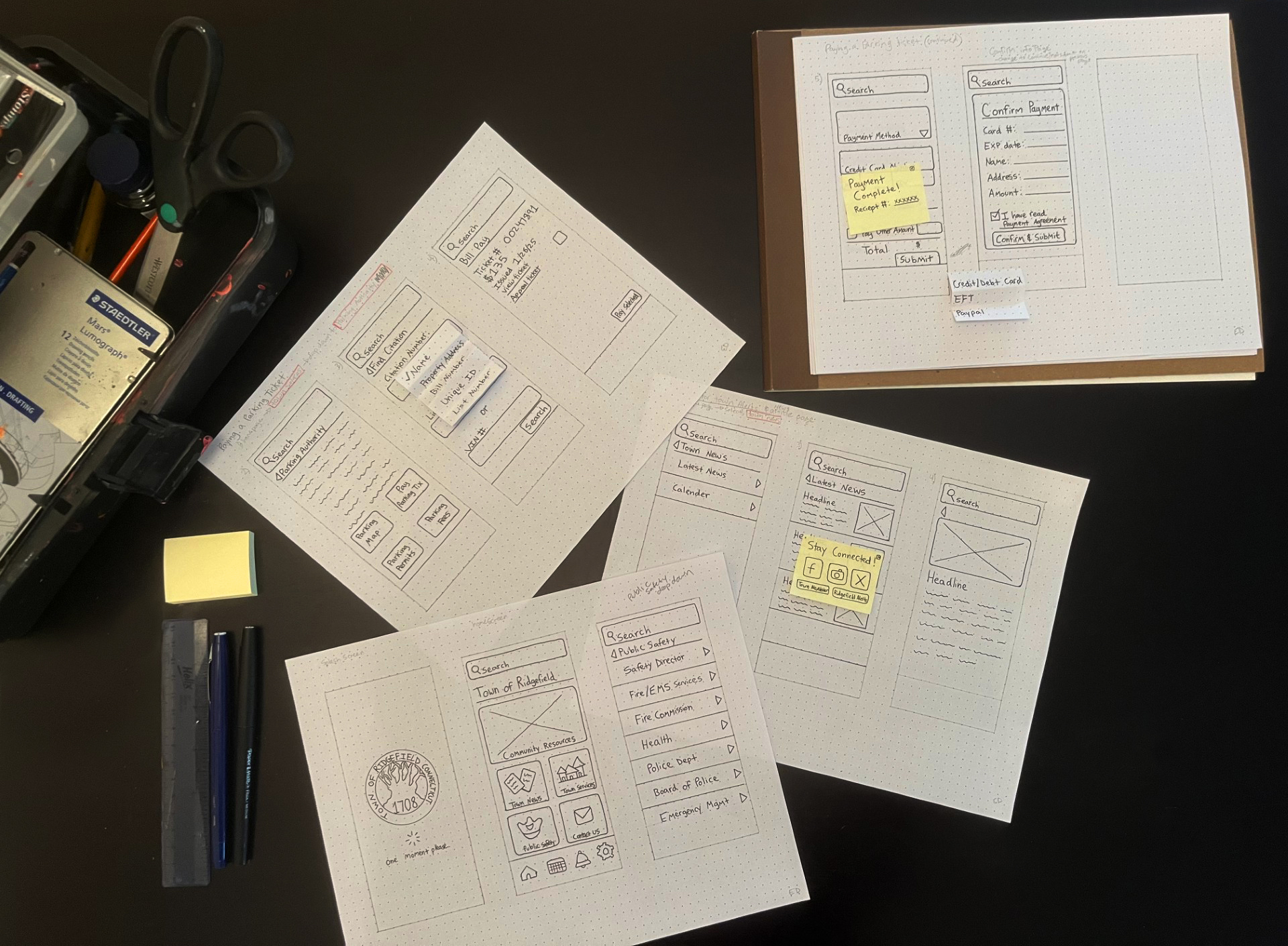
My sketches taking over the kitchen table.
Getting Started
After researching some typical navigation patterns, I was excited to start envisioning just how the app would look and how Ridgefield residents would interact with it. An important part of prototyping is to remember that the user will have no instructions when downloading your app, so always try to make your system intuitive and user-friendly. No need to exert yourself trying to reinvent the wheel where it’s not needed. Often, good UI is simple…minimize the confusing imagery or wording and maximize user efficiency.
User Tasks
Using my app’s information architecture, I decided on a few tasks to draw out:
- Paying a tax bill
- Finding and adding an event to the calendar
- Signing up for town alerts
- Paying a parking ticket
- Finding the EMS services application and filling it out
For this project, I am focusing on creating a mobile app. So, I already know what screen size my prototypes should be. For this, I just used my own iPhone to trace the screen size onto dotted graph paper and began to sketch the homepage, based off my information architecture. I was also able to look back at my user flow charts to see about how many screens would be needed for some tasks.
Navigation
Prototyping each step the user would take led me to think about the navigation and what elements would stay consistent throughout the app. For one, I knew that having a back button always present is important, since an app like this contains a lot of different content and many avenues to get there. This simple button can easily enhance user experience and match the user’s mental model in terms of navigation. I also wanted to keep other buttons on content pages large with plenty of spacing in between, so that clicking on them would be seamless. I also wanted my main navigation buttons to show all the subcategories at once. For this, I envisioned the list of choices coming in from the left side, with an arrow next to each category, showing the user that they would be redirected if clicked on. In sketching this, I realized the community resources tab does not fit, which got me thinking that maybe this tab should be split into two group before breaking off into different pages. This is something I will have to revisit again. But overall, I was hoping to prevent scrolling fatigue by showing the user all choices at once.
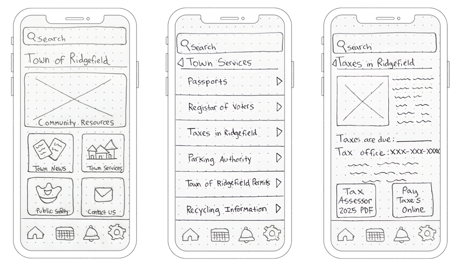
The homepage (left), the horizontal slider navigation (middle), and the Taxes of Ridgefield page (right).
Another main component of my app is the bottom navigation bar. Through prototyping and sketching, I ended up changing the buttons I originally chose when first doing my site map. I decided that if I wanted to have a bottom bar then it should have buttons that will be used often. Because of this, I landed on having a home page, a calendar, notifications, and a settings button. For many Ridgefield residents using this app, viewing their calendar of events will be a primary purpose, so having this button there seemed like a no-brainer. Of course, a home page button is also necessary to create a clear path back to the home screen. As for the notification button – I thought this would be good to have since many other users will be using the app to stay informed and this is a great way to keep up user engagement. Lastly, the settings button shows that the app has personalization options and features that they can tailor to fit their exact needs. From here they will be able to move the home screen tiles around, which is something I always enjoy doing if an app allows it.
Interaction
Prototyping also forces you to think about interaction and how users will be interacting with specific screens. For example, how will they input information to fill out a form? Or how will you show multiple checkout options? For the Town of Ridgefield app, there were many tasks that involved showing drop-downs for payment options and forms where users would have to type. For the parking ticket task, I had to think about the best way to show the various payment options and for this I used sticky notes. This common office supply item was the perfect tool to represent a drop down that you would see online when paying a bill. As you can see below, the payment method box has an arrow next to it, signaling that there are options. When the option is selected, it has a check mark next to it, confirming the user’s choice.
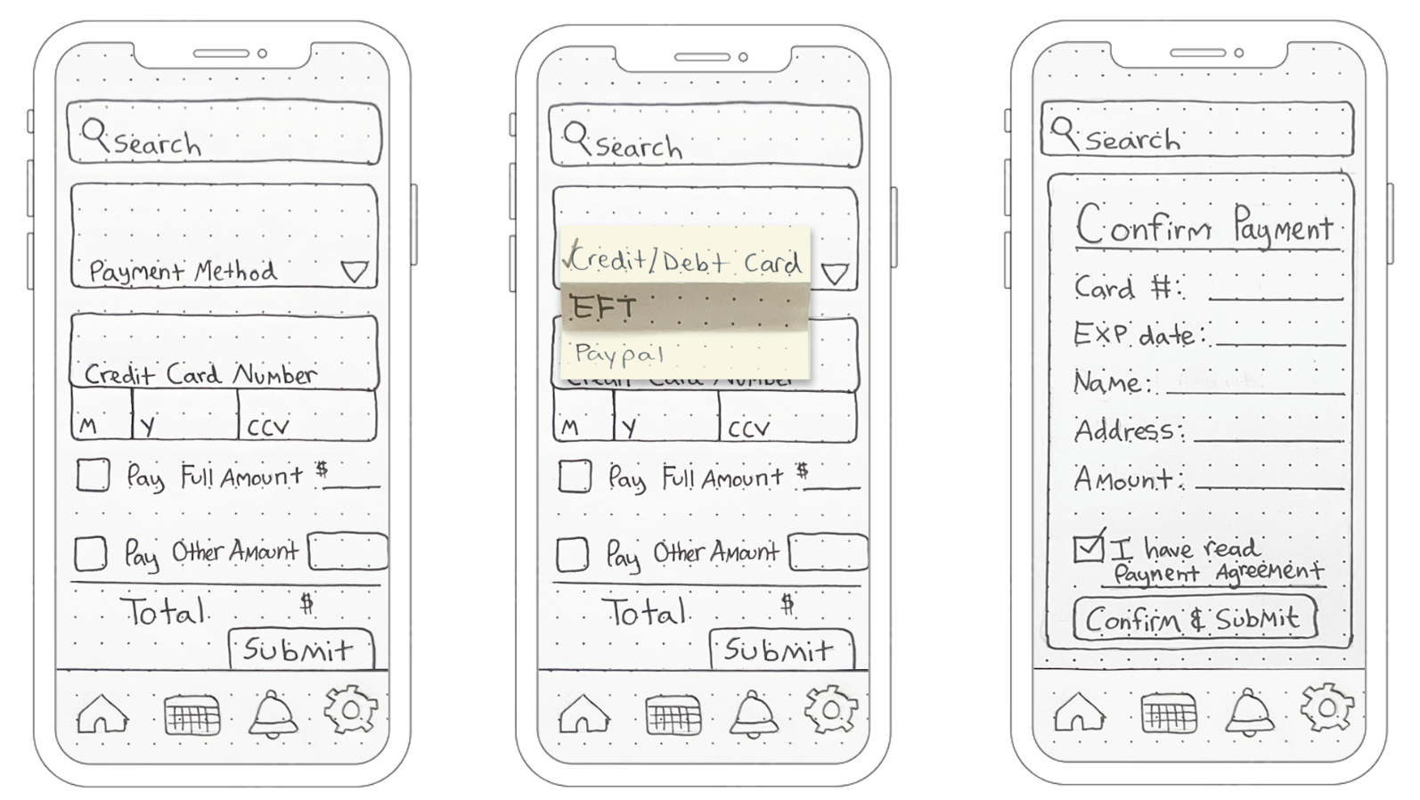
My three sketches showing the payment page, payment drop down, and the confirm payment screen.
Another important screen which I focused on during this process was the confirm payment screen. For me this is a very important screen that cannot be skipped. To help users have a better overall experience with your product you need to help eliminate user error. So, for all payments done within this app, before a payment is submitted, another screen will appear and ask the user to confirm, read the payment agreement and then hit submit. Checking over your input is necessary, especially when doing this on a small screen and possibly on the go.
In the Ridgefield app, I also planned on having confirmation popups once a task is completed. For example, after signing up for town alerts, the user will get a popup that says “Success!”. With this pop up, they have the option to exit out, which leads them back to the homepage or to click on “back to latest news”, which takes them back to the news page. I felt this was necessary in allowing users to control where they should head back to, since some will want to close the app out while others may still be browsing. This improves navigation and reduces frustration.
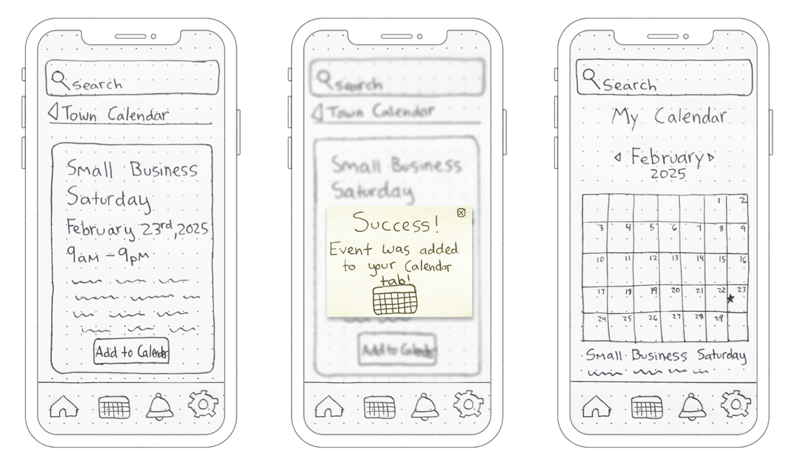
Detailed events page (left), “Success” pop up (middle), and the My Calendar page (right).
Finishing Up
After sketching only a few screens, I was able to finalize placement of images, texts, and additional links for the rest of the screens. From my quick sketches, I then redrew them at 100% scale and outlined them in pen. These were my cleaner, more presentable versions. Once I put them in order, I went through each one with eyes of a user, to see if I could indeed complete the task with what I drew.
Seeing each task come together made me realize just how many screens your average app has, and how much work goes in to even the simplest app! Low-fidelity prototyping is not only a way to bring your ideas into perspective, but to also think about your product from the user’s point of view. This part of the project allowed me to step away from the computer for once and to focus on the simplest part of design. Using lines and shapes to convey concepts. Through prototyping, my sketches created this week will allow me to create stronger design concepts in future weeks. Stay tuned!
To see my process on the Town of Ridgefield app, you can view my PDF below and follow my blog to see weekly updates.