Over the past few weeks, I have been scrutinizing and studying a website called girlshealth.gov. It is a teen resource that provides medically accurate articles, self-help tips, and additional resources on topics like body, nutrition and relationships. They are a leader in the health and well-being space for teen girls and they are a part of the U.S. Department of Health.
If you clicked on the link, you probably understand where this post is headed. You don’t need to be a UX researcher to see how outdated the site is just by a quick glance. But old stock photography and cheesy clip art aren’t the only things that make me cringe when I scroll the homepage. My original findings involved difficult navigation, an overwhelming number of tabs on the homepage and articles that had dozens of links throughout. This led to the idea that girlshealth.gov would benefit from a total redesign. But no redesign can get underway without first doing some deep research on the site itself and how users are interacting with it.
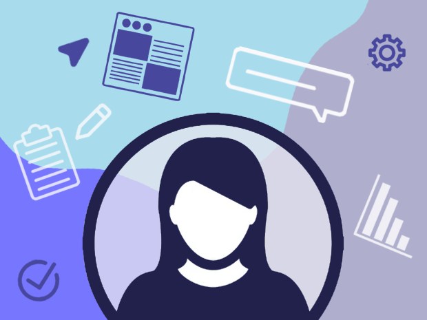
Personas and Scenarios
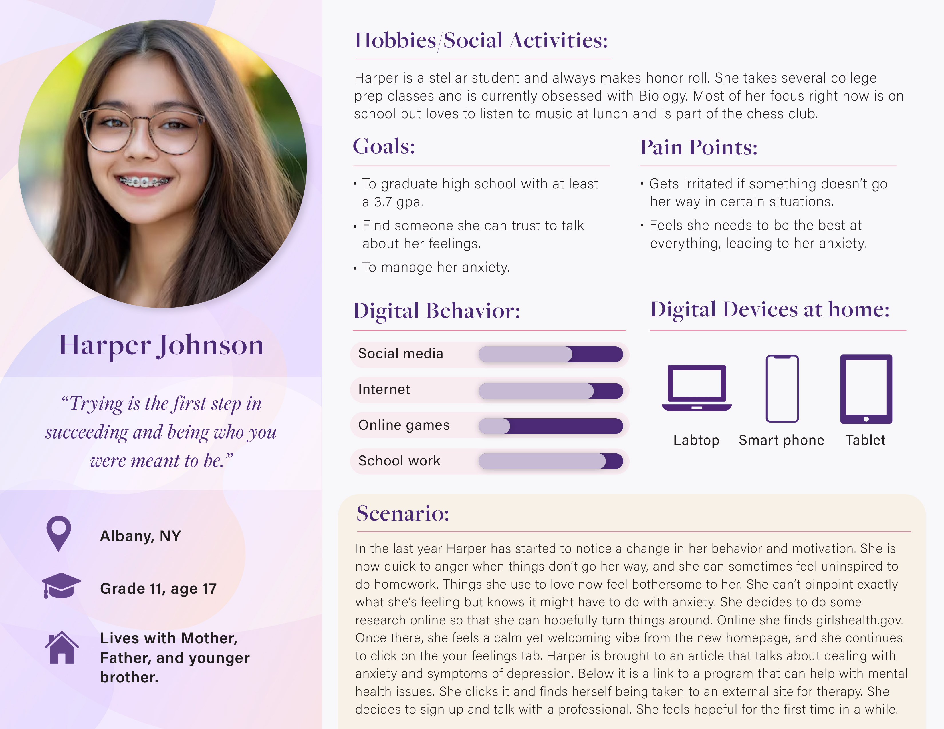
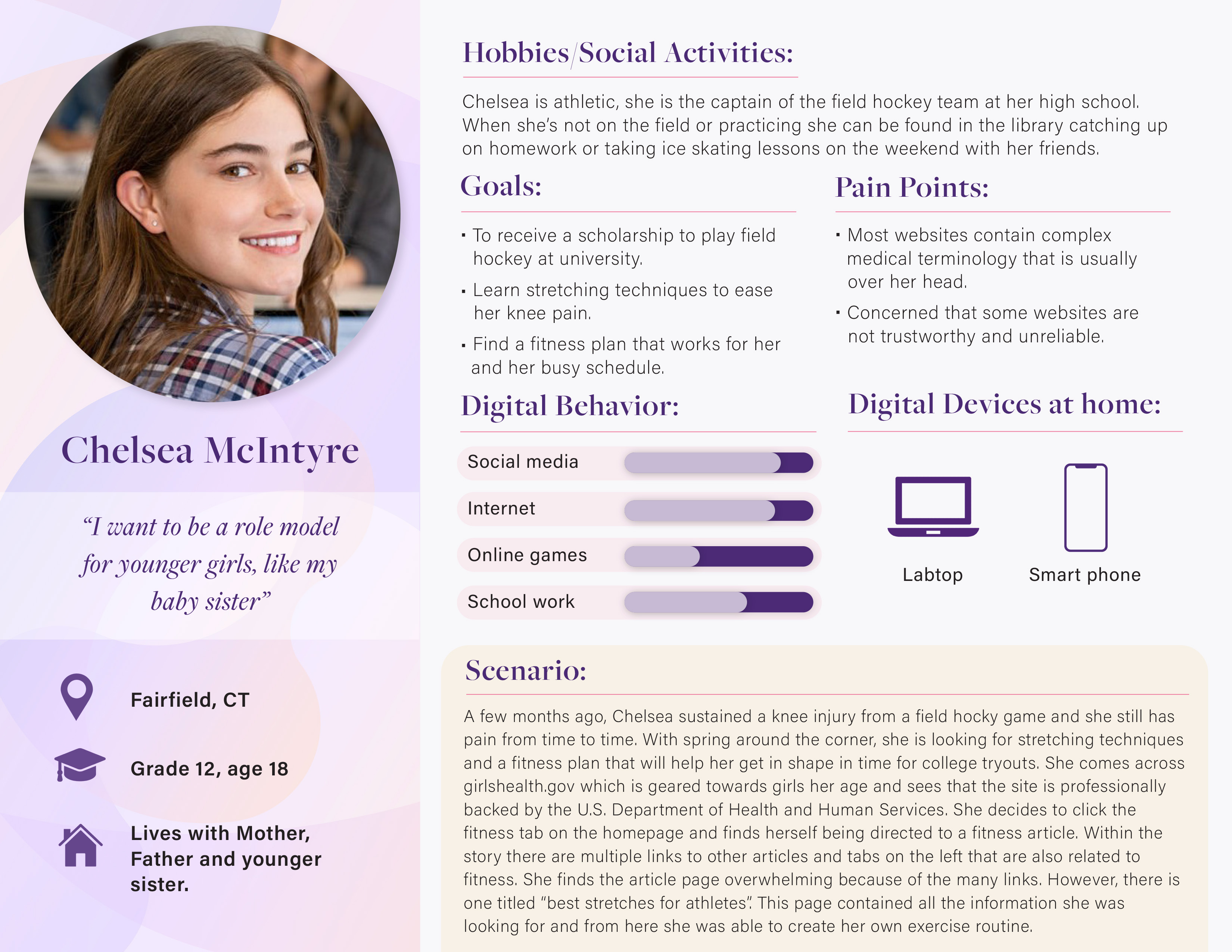
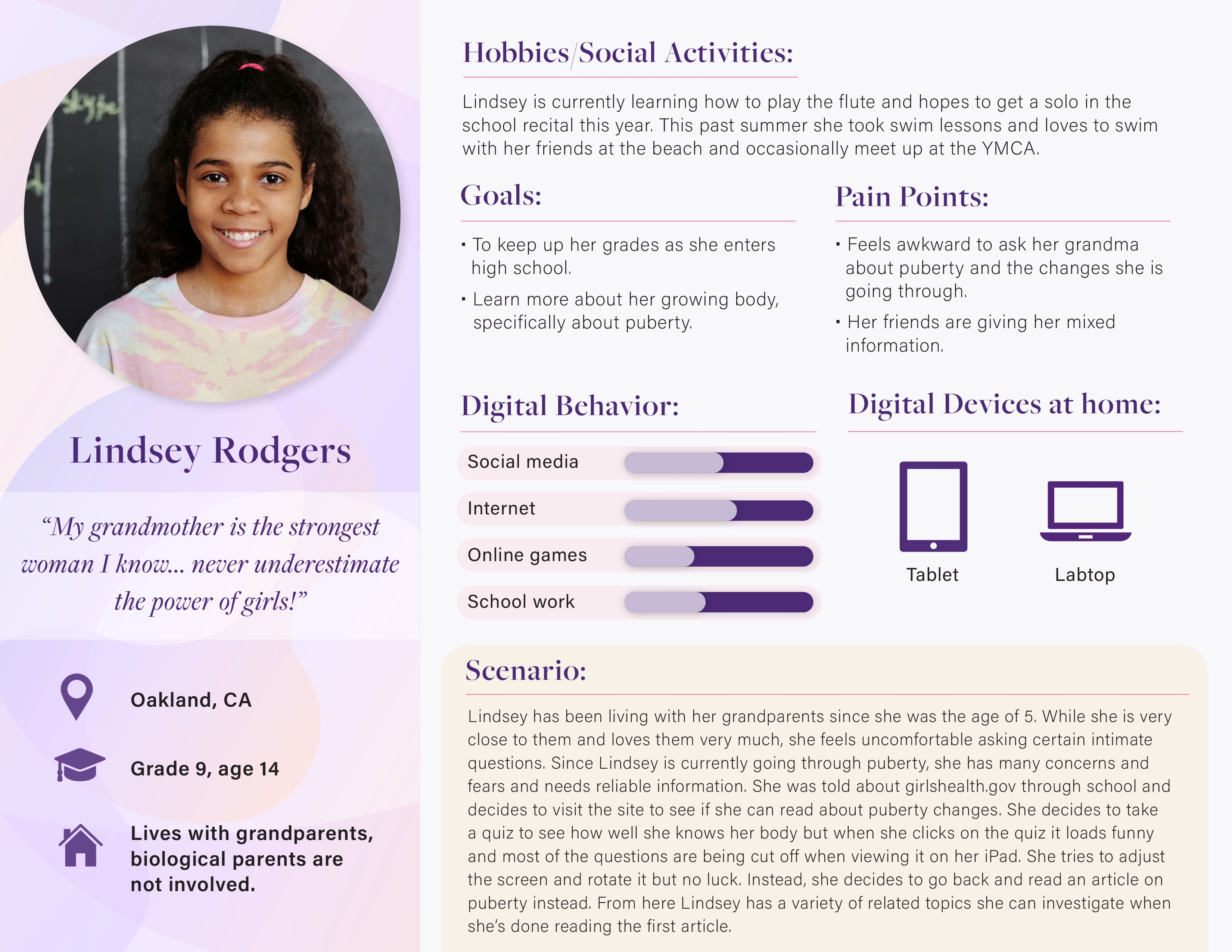
My first step in my research was to create personas and scenarios of typical users that would use the site. This helps the designers visually put into perspective who they are designing for. It also gives me a clear look into what the users need from the website. Below are three users I created. As you can see, each persona includes vital information like the digital devices they own, their goals, and the pain points they have (that girlshealth.gov should take into consideration). Once I created these, I often went back to them to remind myself of what design changes would be accepted and needed by a teen audience.
Interviews, Surveys, and Diary Studies
From the personas and their matching scenarios, I was able to create an interview script, a survey, and a diary study that could be sent out to users to collect feedback. Each would gain insight on user behaviors and their thoughts on the site/brand.
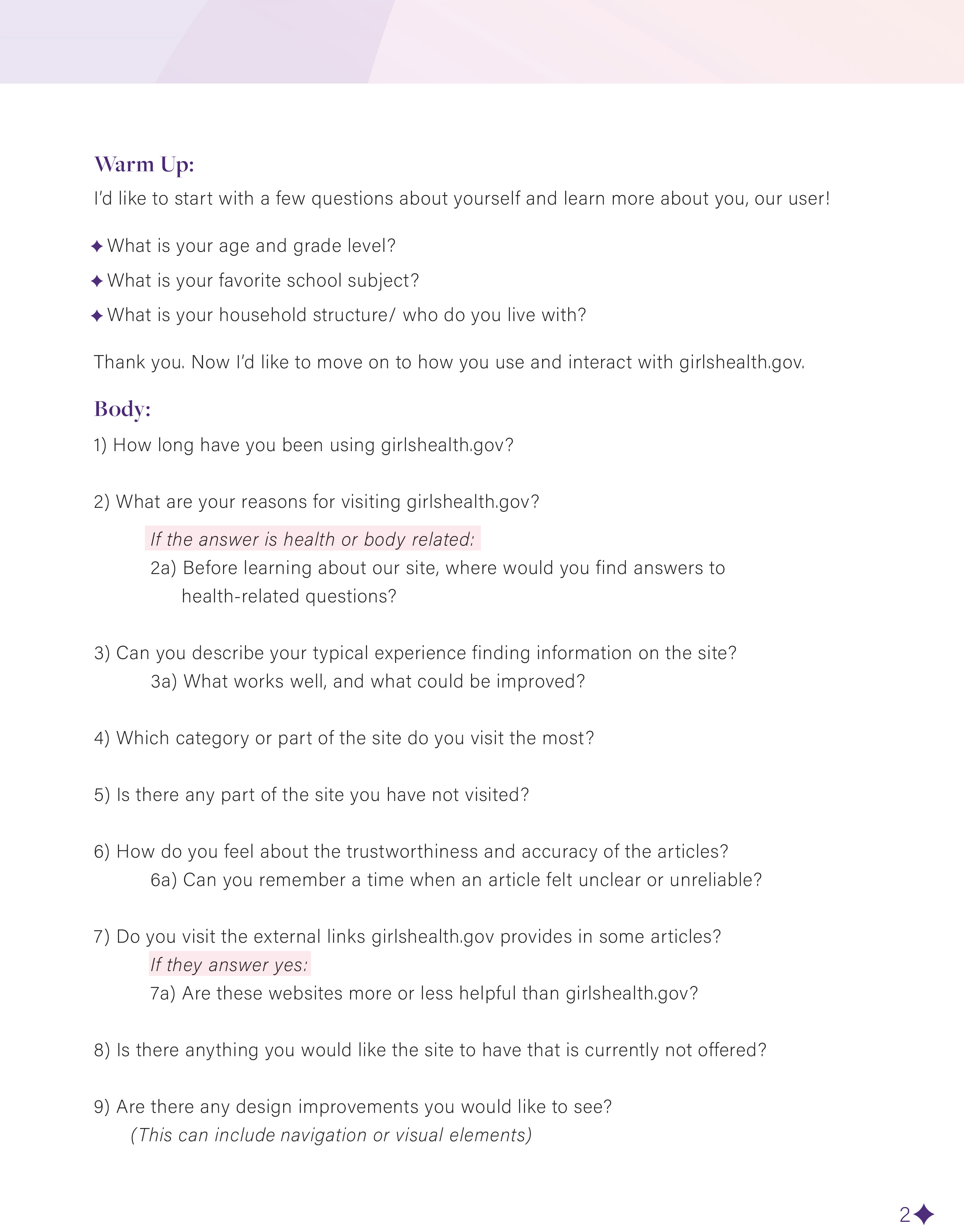
For the interview, I created 11 questions that focused on what type of content teen girls were researching the most and if the content they were reading was comprehensible. This was most important, since girlshealth.gov is a medically backed site, where they pride themselves on providing the most up to date information for a teen audience.
For the survey, I created a longer, 20 question evaluation that covered more specific questions. It started out with asking how teens usually find information related to health and how often they visit girlshealth.gov specifically. The questions then moved to how satisfied they were with the site and if there were features they found difficult to use.
The point of the survey, interview, and diary study was to evaluate what users were doing, how they were finding their answers, and if they were becoming informed or frustrated.
The Card Sort
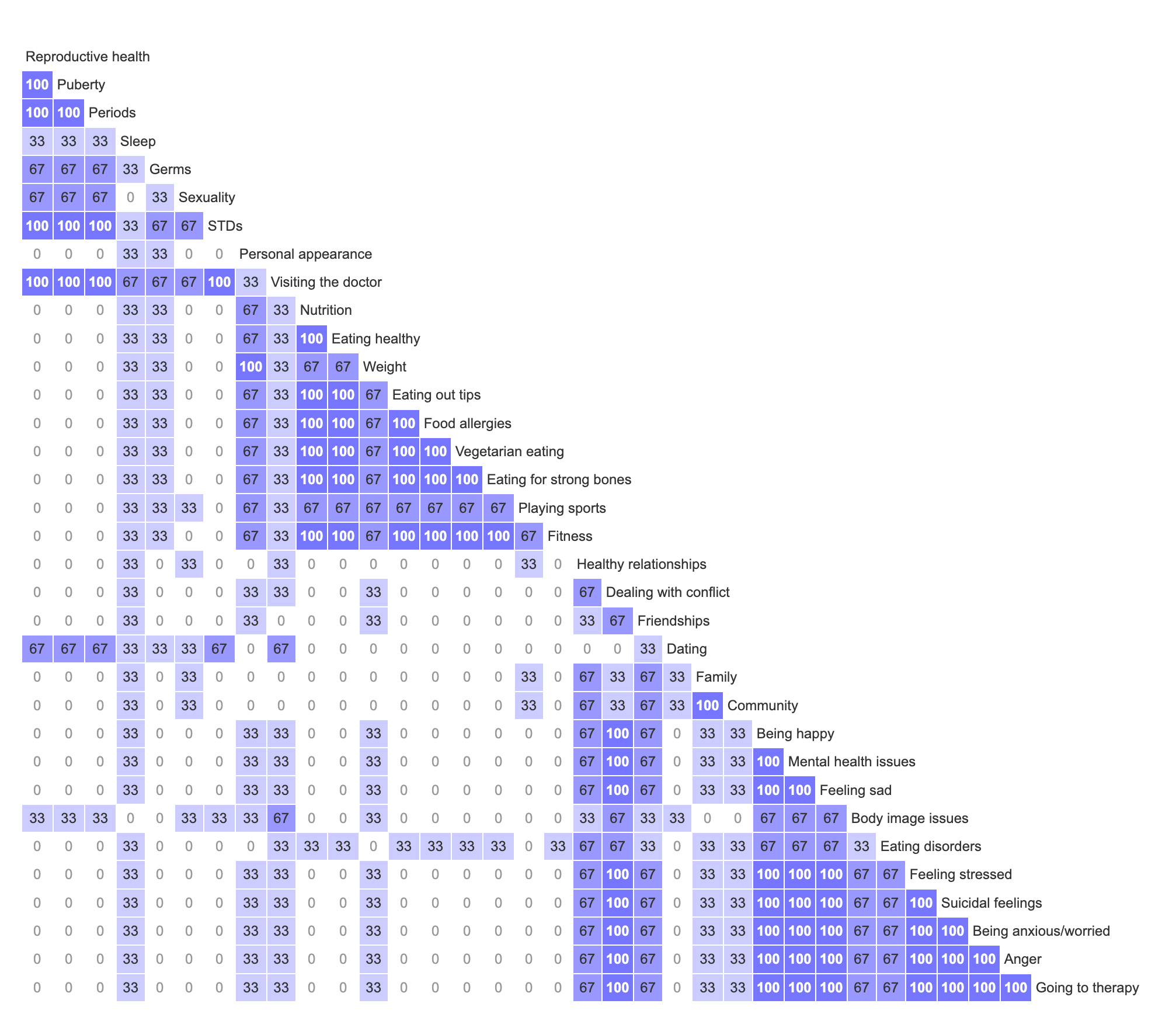
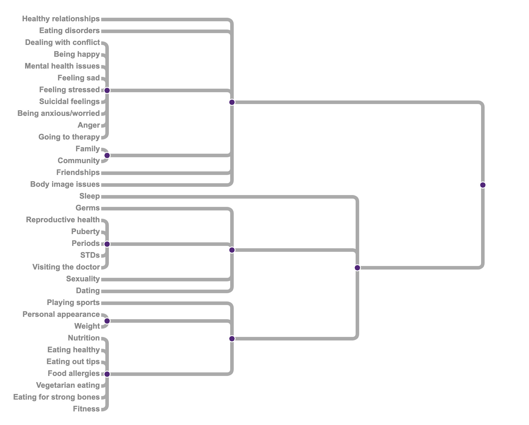
Since gaining UX research skills, I decided it was now time to do a few studies with real participants! The first study was a card sort. Here I used the program Proven By Users to create 34 cards that represented most of the tabs or topics used within the site. The purpose of the card sort study was to see if users would organize these topics similarly to how the site organized them or if they would create totally new groupings. As most card sorts do, this is a great way to see if a user’s mental model matches up with what they will encounter on your homepage. For girlshealth.gov, I had a feeling new groups would be created simply because their navigation wasn’t very organized to begin with, and I was right.
The results showed that some cards were grouped similarly, but all participants grouped cards into larger categories rather than smaller, more specific ones. Based on the data, the three new, large categories that I came up were: mental health guidance, sexual health, and your body & nutrition.
There were some instances where themes emerged. For example, the nutrition category was an exceptionally strong grouping. The only exception was that eating disorders was usually classified within the mental health category. Probably because it was seen as a disorder rather than for nutritional guidance. Another was that the cards family, community, and friendships were often grouped together, but also put in the mental health category. From one participant’s feedback: relationships of all kinds are usually seen as mental health boosters and therefore support a person’s mental state.
From this data, I created a similarity matrix and a dendrogram visualizing the strong card pairings and main category groups.
The Usability Test
I also wanted to try a usability test on the users. This is an important research method that allows participants to try and complete a task while also thinking out loud so that I can understand their thoughts and emotions as they work through the site. I came up with 5 tasks for each participant to do that would allow me to see if features were working well or causing distress.
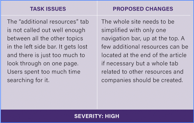
The results…well they were also shocking! All participants got frustrated at one point or another during the tasks. Often it was related to difficult site navigation, or certain pages that were simply not what they were envisioning. It was clear that girlshealth.gov needs new tabs on the homepage as most users got lost after browsing an article or two. The contact us page also needs to be updated. Instead of a phone number and an address for snail mail, users want a contact form right on the website.
One user was also found having trouble using the search bar and said that results were difficult to read because of such a crowded results page. I personally agreed with her, and saw that results came with a long description as well as the full URL link, even though the article was a part of the website. For a search bar, the results were not clear enough, and often the user couldn’t find what they were looking for. This is unacceptable in today’s fast-paced society.
Two users were also very distressed when asked to get to a quiz from the homepage. Here it was discovered that the link to get there is actually a small line of text underneath a large image and header that says “quick quizzes”. The participants kept clicking on the image and title, yet were never taken to the quiz. This is a major error I discovered during the usability test that became a top revision for the redesign.
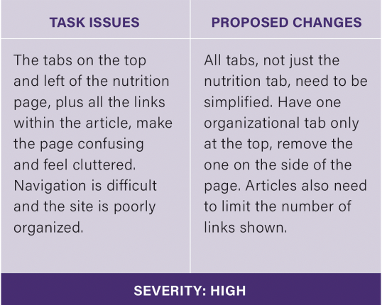
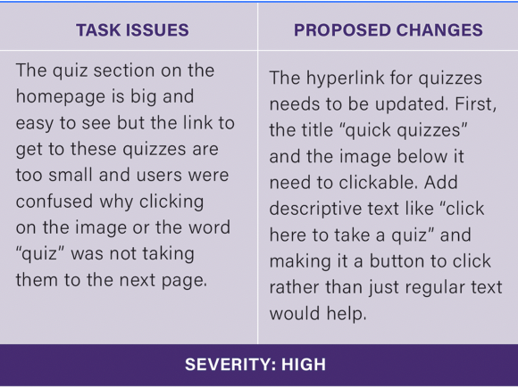
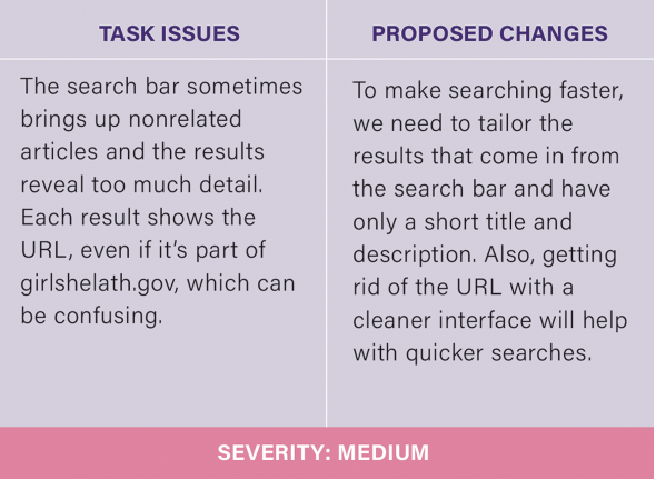
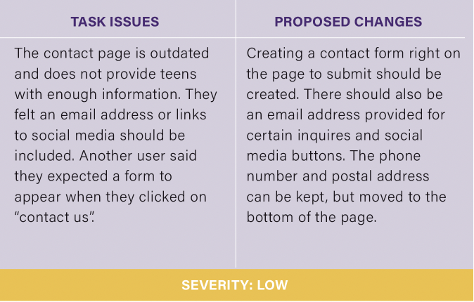
Task issues with their proposed changes and severity rating.
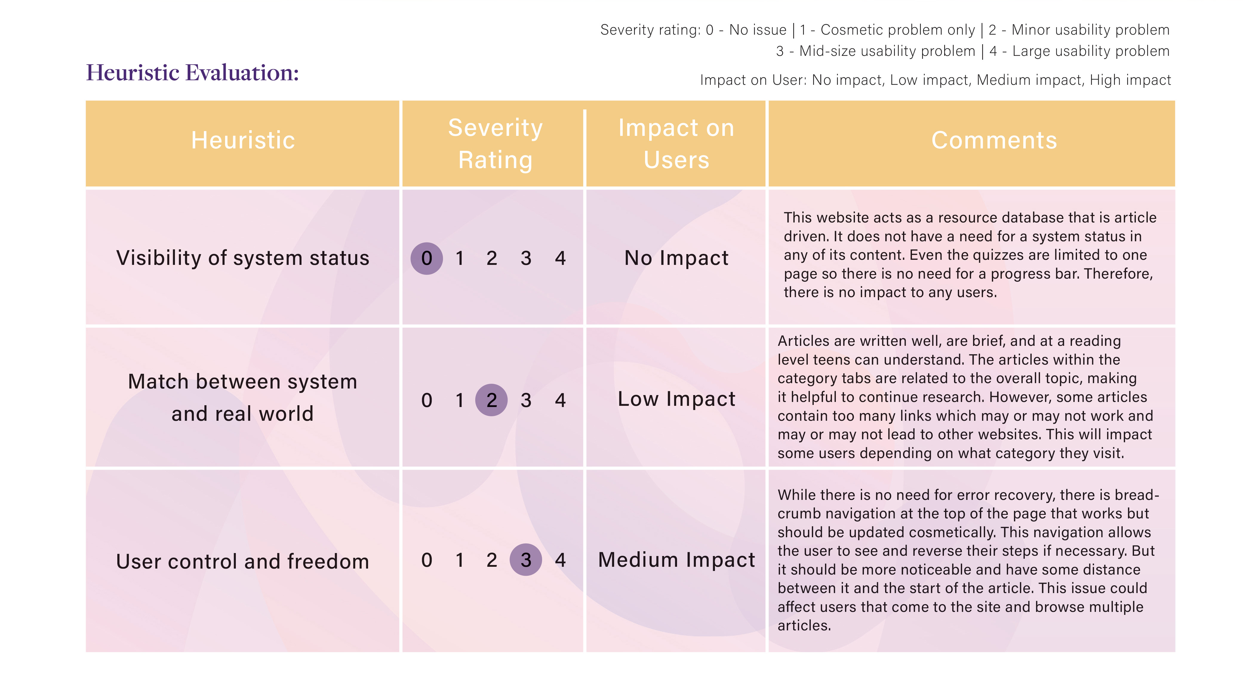
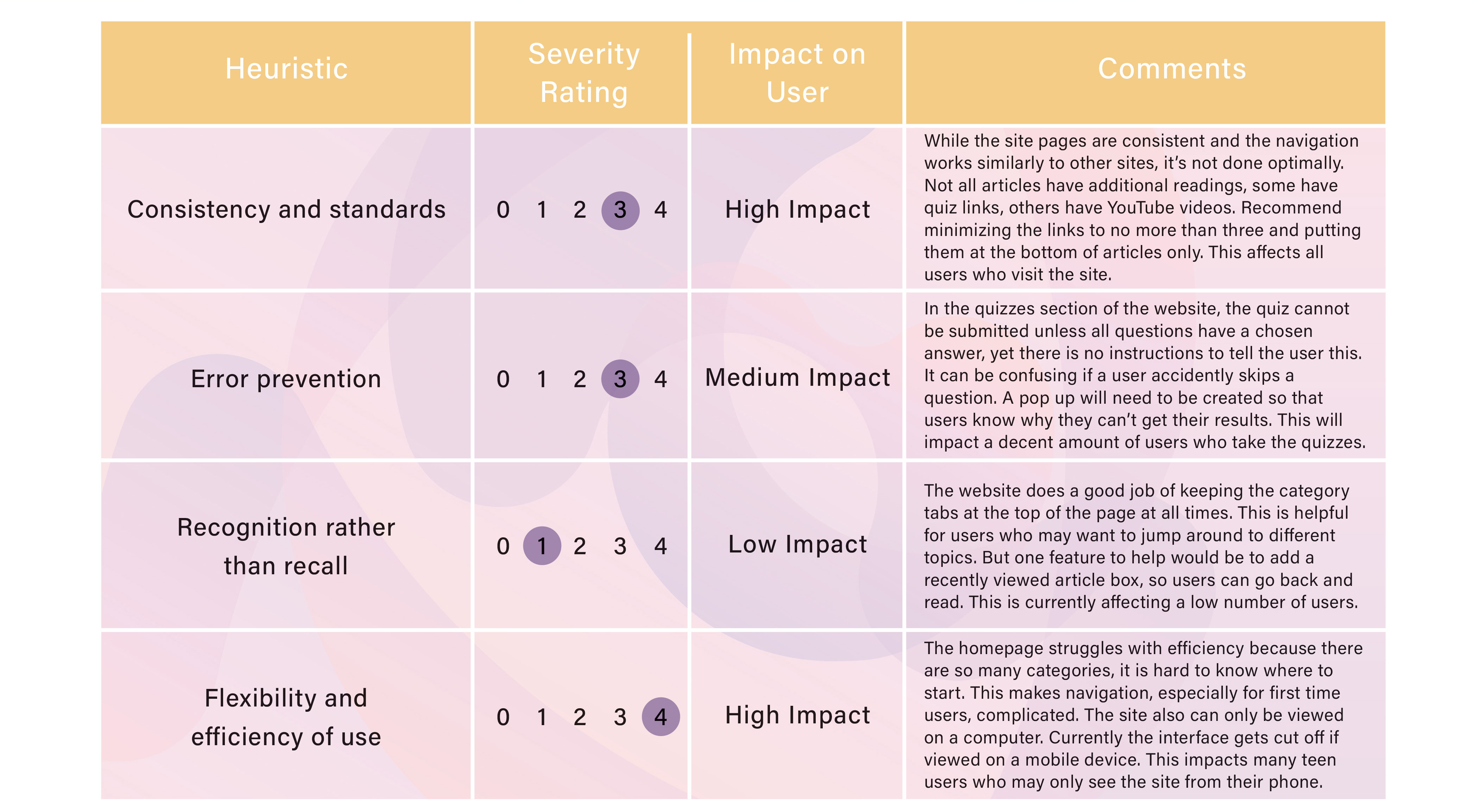
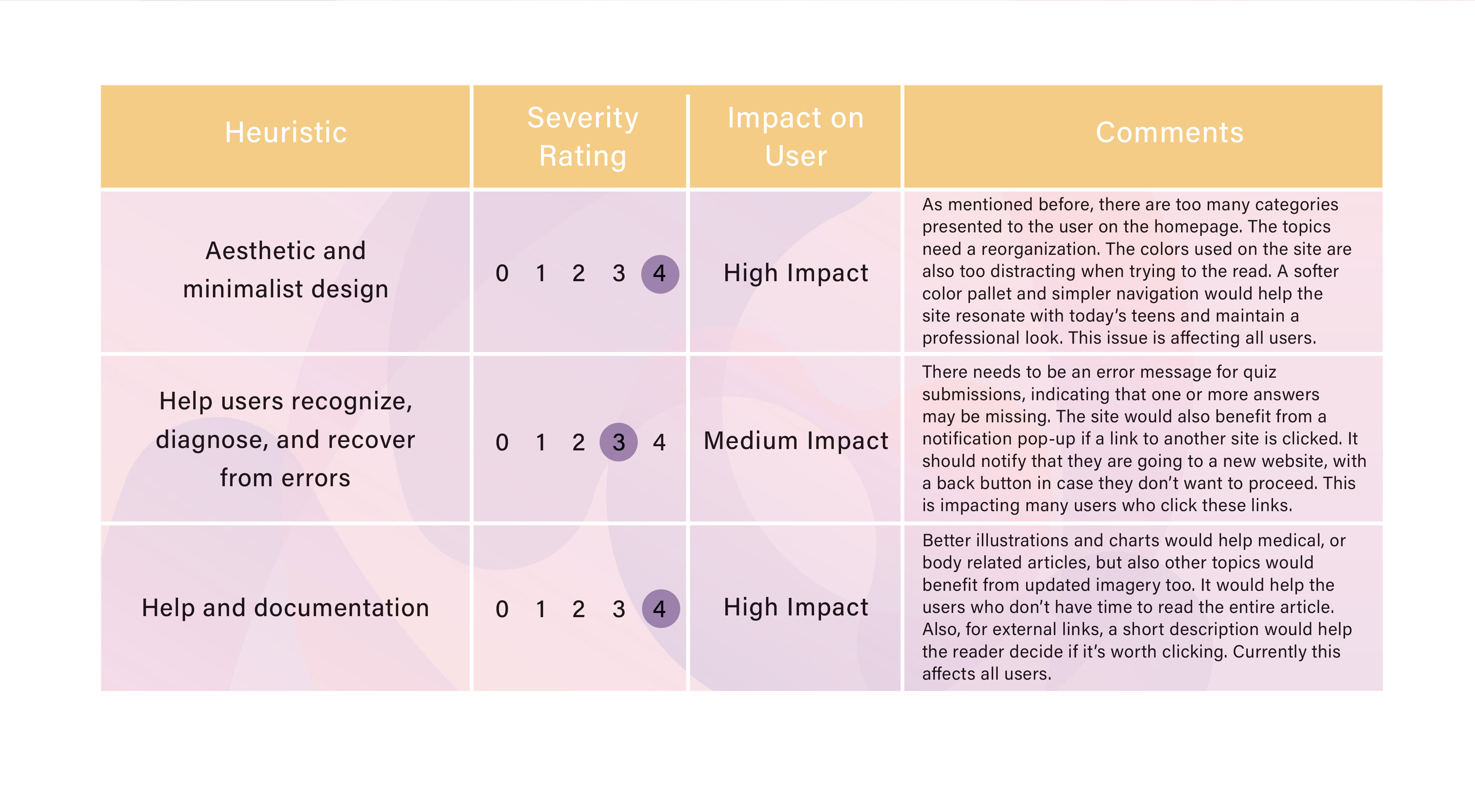
A Heuristic Evaluation
From this research I was able to then evaluate the site on my own by doing a heuristic evaluation. This type of test does not involve any end users. I only had to go through each heuristic rule and identify areas where the heuristic is not met. From this, I was able to see the sites strengths and identify weakness.
As you can see from the chart below, the heuristics with the highest severity rating (most urgent to fix) was flexibility and efficiency of use, the sites aesthetic, and its help and documentation. As mentioned before, the site’s navigation is difficult for users. So, a new way to organize all the information will be a big endeavor for designers, hence its severity rating is a 4, the highest. The site’s aesthetic is also something I want to change because the brand needs a new professional look that appeals to teens. The current colors are just too distracting and make it difficult to read articles. Lastly, the help and documentation of the site could be improved by providing better illustrations along with the articles and images that don’t feel childish.
Conclusion
From all the UX research, the issues found were much larger than I was anticipating. But the changes I came up with for the redesign all now have purpose and reason. Without this, I would have started this type of project by making changes I felt were necessary. But now, each change has data behind it, to show why it’s needed and why it’s important.
In order to keep teens coming back to girlshealth.gov, and in hopes of gaining new users, the following site changes will have to be implemented:
– Creating a responsive website that can be viewed on a variety of screen sizes.
– An updated look and feel to the site with new colors and logo.
– New site navigation with new category topics and sub-categories.
– Making “additional resources” its own tab on the homepage.
– An updated search bar that kicks back better results on a cleaner page.
– A new contact us page with a contact form to submit.
– Updating hyperlinks in the quiz section.
– Eliminating some links from article pages.
This research process has been an eye opener for me. I discovered that user testing is an invaluable part of the design process. For an organization like girlshealth.gov, the only way to improve their site is to implement these changes so that users can successfully navigate and browse the site as they wish. The issues I uncovered were much deeper than I originally thought, allowing me to see how design testing can not be rushed though or skipped over.
If you would like to see my full report on this research project, I have attached it below. It is a large report with all my studies and the results in one place. I think you’ll be surprised to see just how much information was uncovered.