An overview:
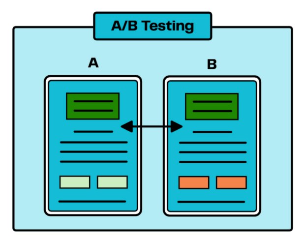
A/B testing is a common UX method that is used to compare two designs against one another. You can often see designers using this method when tasked with creating two versions of one product. This method is sometimes referred to as a split test or bucket testing. In these test settings, you have the A version as the control and B version as a variant. For A/B tests – the two designs can be very similar, with only small design changes between the two, or have them be drastically different.
This type of study can be done usually in an hour with around ten participants. Depending on your subject and what you are testing, you may want more participants to get a better idea where your users stand. But only if you have the time and money for a large study. Ten is usually a good place to start and will give you enough data to make an informed decision.
What to test:
With this UX method, you can understand and test the impact of your design changes, big or small. Your data can then help you determine how to provide the best customer experience with your digital product. Some things you can test with this method include web pages, email campaigns, overall navigation, copy points, or images. Whatever your goals are for your product, this should be kept in mind and can help you ultimately decide on what specifics to test. The metric for deciding on which version did better should also be easily measurable.
Instructions and tools:
Tools you need to conduct an A/B test are as followed:
- Two prototypes or mock-ups of your product. (These can be as detailed and as close to the real product as you want. This may also mean you need a computer for your participants).
- Ten or more participants to take the test.
- A testing tool to collect results (This can be done manually or online with Google Optimize, VWO (Visual Website Optimizer), Optimizely, or AB Tasty).
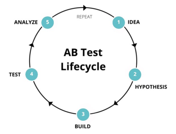
The first step in conducting an A/B test is to figure out your focus or idea, what do you want to test? Once you know what changes you are testing between the two, building two versions and labeling one “A” and one “B” will be needed. These will be given to your participants. Next, the participants will be “tested” and interact with both prototypes for a certain amount of time. They will be asked at the end which one they prefer. Once all participants have done the study, you tally up the results or look at your data collection tool to see which option was preferred. This data can be shown as a pie chart or as percentages to see who preferred which version. To make your data more reliable, remember that you can test and retest until you get a significant amount of data and reason towards a certain design. Finally, you can now take these results to the designer, so they know which version to implement!
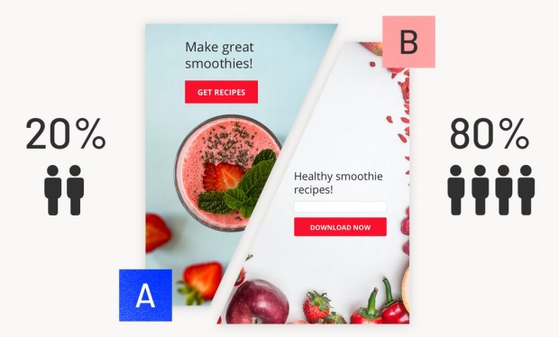
Here it shows users preferred the B version.
Case Studies:
Many companies use this testing method often because differences in design and layout can have a huge impact on how your audience sees you or the product. Doing this type of test is a no-brainer when large companies have multiple changes to an online product and need to see which would work better.
Airbnb is one company that uses A/B testing all the time. In one case study I read, they used it for multiple design decisions, including better user navigation and to better its review system. In 2018, they tested this new review system, which allowed guests to rate their stay on a scale of 1-10. It was tested against the original version which was a 5-star rating. What they found was that the 1-10 scale was not preferred by users. Today on their site we can see they still use the 5-star ratings for properties.
Google is another company that uses A/B testing. Their semi-famous 41 Shades of Blue Experiment tested to see if the color/shade of a button affected user engagement and satisfaction. With over 40 tests conducted, the results showed that a purple-blue hue was more appealing, lead to more clicks, and gave the company an increase of $200 million in their annual revenue. However, they did get criticism for using this test because screen color may look different for each user, depending on how their computer is calibrated.
Conclusion:
Overall, what makes A/B testing so great is that it can be used for any business or industry. Whatever you plan to test, you can learn more about your user and what works best for them. This UX method can be an easy way to back up your design decisions to stakeholders and help you improve product engagement. For any business, the results you obtain from this test is critical to help you stand out in a competitive market.